# teenage engineering — Style Reference
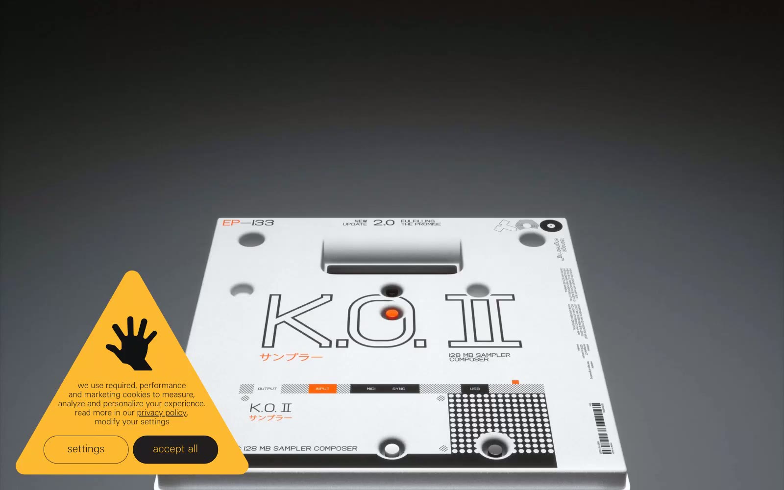
> industrial catalogue under studio light — the product is the only rich object on the page and everything else is whispered around it

**Theme:** light

Source measurements are normalized; roles and recommendations are interpreted. Font summary lists are independent, not paired by position. HTML examples are reconstructions, not source components.

teenage engineering reads as an industrial product catalogue rendered in typographic whispers: a near-white canvas of #f6f8f7 hosts photographed products on seamless studio backdrops, while everything else — nav items, body copy, borders, labels — sits in ultra-thin weight 100 type that almost disappears into the page. The contrast comes not from ornament but from material: products are the only dense visual objects; the UI around them is mostly negative space, hairline rules, and one occasional dark band of #0f0e12 that acts like a display case wall. Zero rounded corners, zero drop shadows, zero gradients — every edge is a straight cut, every surface is flat. Color is deliberately rationed: pure black text, gray hairlines, a slightly purplish near-black for inverted sections, and a single chromatic note (the amber warning triangle) that earns its presence by being the only non-neutral element on the page.