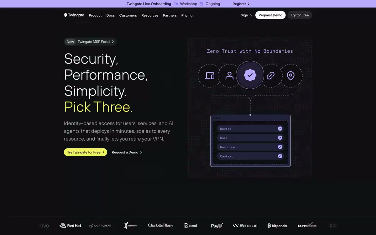

Twingate
带有紫罗兰和黄绿色信号灯的午夜控制室。整个界面位于近黑虚空中,两种强调色像状态LED一样在仪表板组件间脉动,克制、有工程感、略带未来气息,却不炫耀。
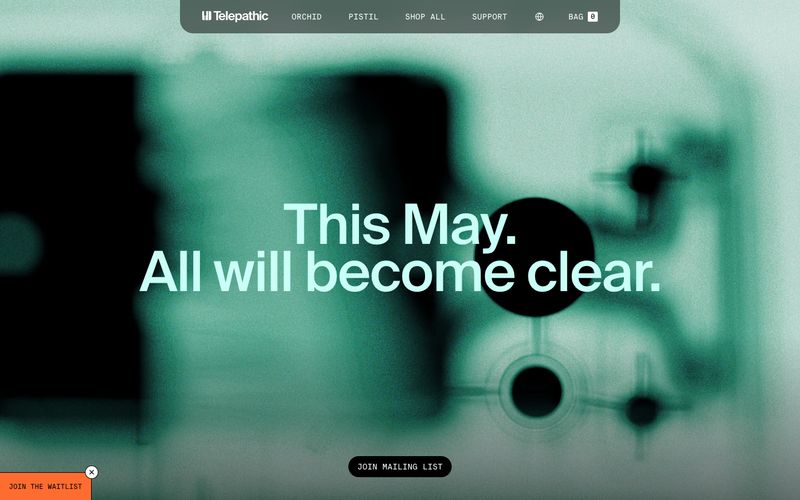

广播控制室在黄金时刻——黑曜石屏幕,温暖奶油色纸张,一盏钨丝灯
Telepathic Instruments 在工作室暗调、广播清晰的视觉风格中运作:大气摄影满幅覆盖逐渐过渡到白色产品表面和胶囊形控件,唯一鲜明的色彩是单个明亮的橙色,其余世界则为单色。排版是品牌的最强表达——Suisse Intl 采用接近展示尺寸,搭配激进的负字间距(最高达 -0.03em),使标题读作工程样本而非营销文案。该美学借鉴了音频硬件UI和包豪斯标识牌:细线边框、平面表面、单一功能强调色、充足的负空间。组件保持低字重和手势感——胶囊按钮、透明描边链接、柔和 24px 的卡片圆角——让产品图像和音乐设备截图承担视觉重量。
查看原始网站带有紫罗兰和黄绿色信号灯的午夜控制室。整个界面位于近黑虚空中,两种强调色像状态LED一样在仪表板组件间脉动,克制、有工程感、略带未来气息,却不炫耀。
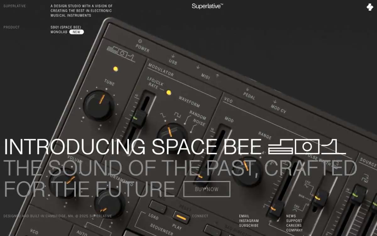

工业产品手册置于工作室玻璃之后。一个暗房展示柜,其中硬件、标签与超大标题共享一个连续、几乎无重的平面。
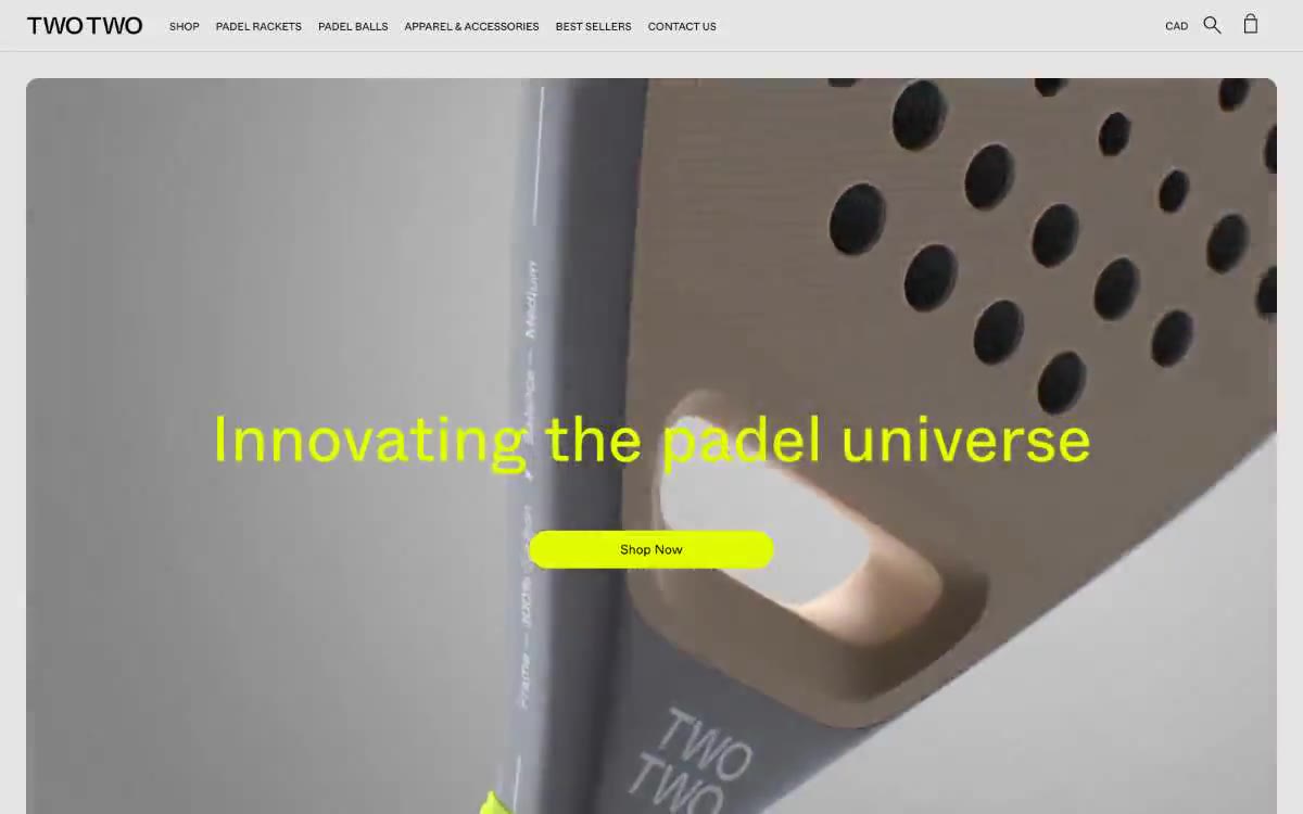

单色混凝土上的电压青柠:黑白编辑网格中唯一的霓虹重击。
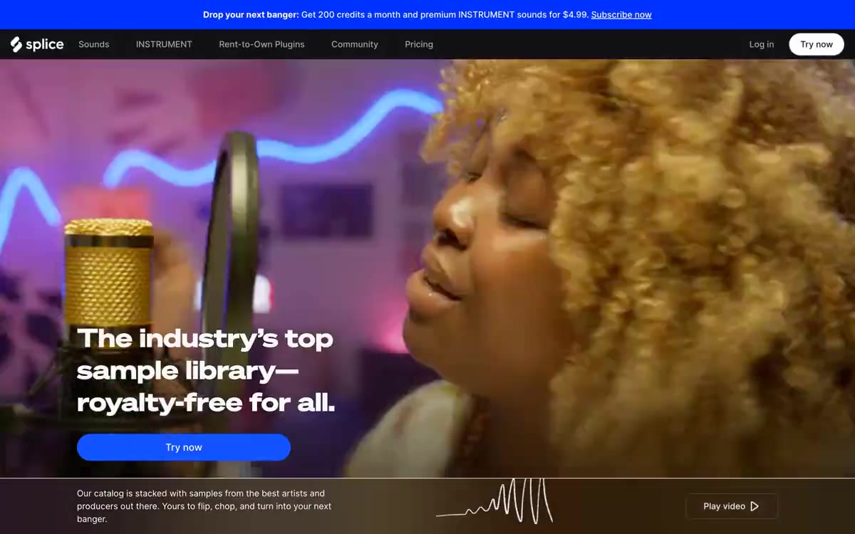

午夜录音室:深色、轻盈的空间中,唯一响亮的东西是音乐。
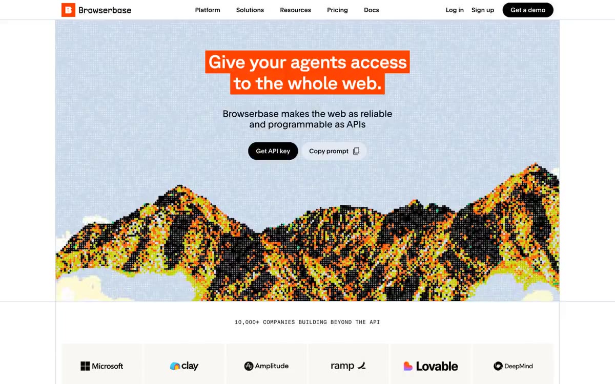

如同编辑式大幅报纸与数据终端相遇:在超大GT Planar标题、柔和粉彩卡片表面和微型等宽元数据构成的近乎单色区域中,唯一热橘色作标点。


午夜控制室:磨砂玻璃面板内部的电光蓝脉搏。