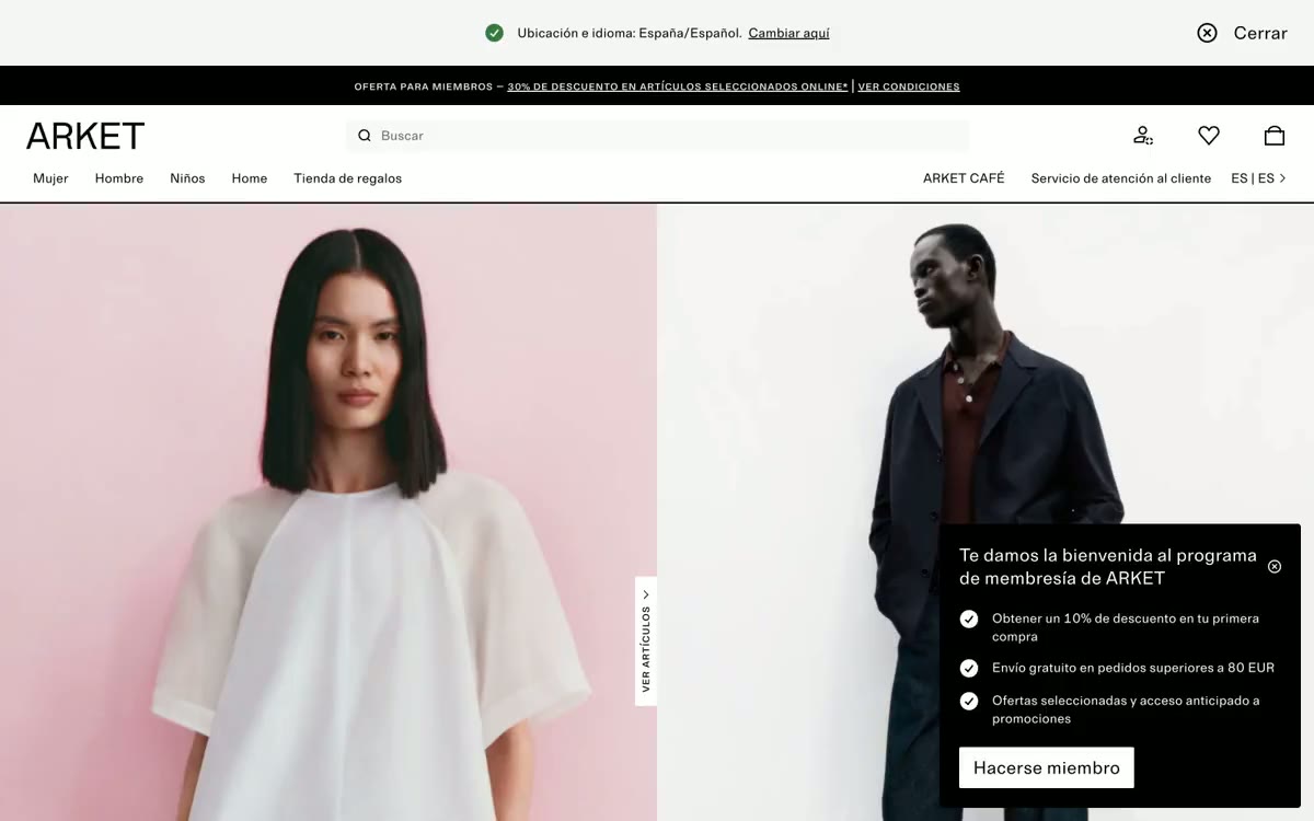
# FARFETCH España — Style Reference
> White-cube fashion gallery. Imagine a high-end retail space where the walls, floors, and fixtures have been bleached to bone, leaving only the garments and the people wearing them to provide every hue, texture, and visual weight.

**Theme:** light

Source measurements are normalized; roles and recommendations are interpreted. Font summary lists are independent, not paired by position. HTML examples are reconstructions, not source components.

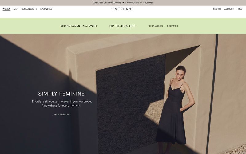
Farfetch operates as a white-cube gallery for fashion: the interface is a near-total absence of color, letting editorial photography carry every visual decision. Typography does all the structural work — a custom geometric sans-serif (Farfetch Basis) at weights 400 and 700, with section titles and the wordmark set in a serif display treatment that treats text as composition. Layout is architectural: centered full-width content, rigid 3- and 4-column product grids, generous 48–72px section breathing room, and zero decorative chrome. Components are unornamented — thin underlines for search, ghost navigation links, uppercase category labels beneath imagery, flat product tiles with no shadows or borders. The only color in the system is the photography itself; the interface is the frame, never the picture.