# ARKET — Style Reference
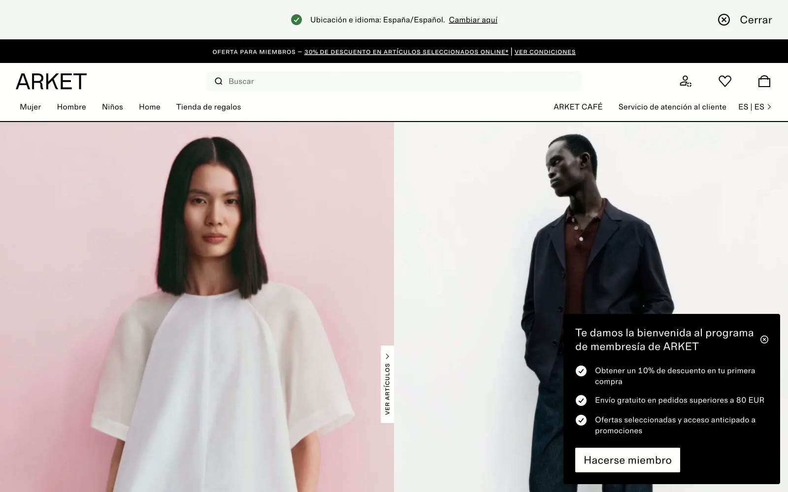
> Scandinavian white gallery. Full-bleed photography on bone-white canvases, hairline rules, and a small-caps monospace labeling each section like a museum wall tag.

**Theme:** light

Source measurements are normalized; roles and recommendations are interpreted. Font summary lists are independent, not paired by position. HTML examples are reconstructions, not source components.

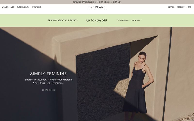
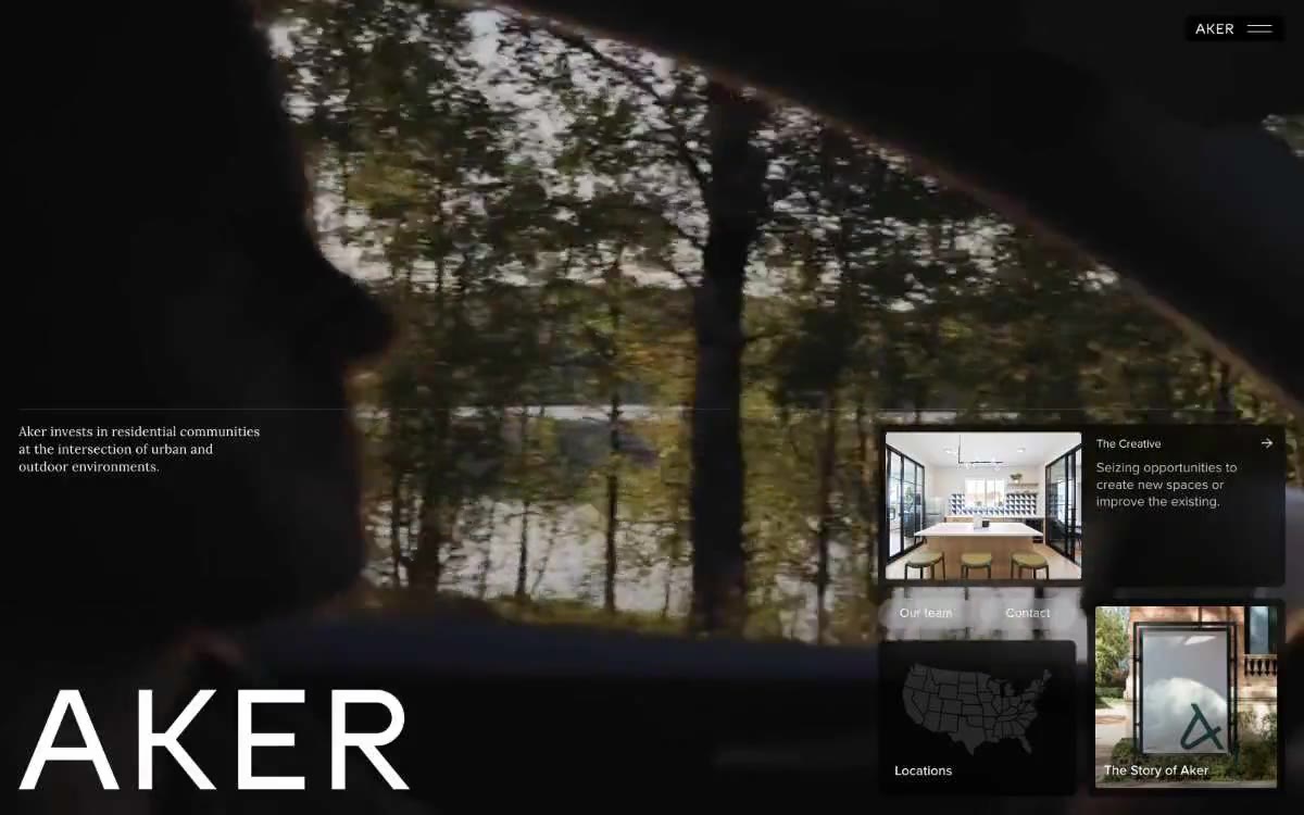
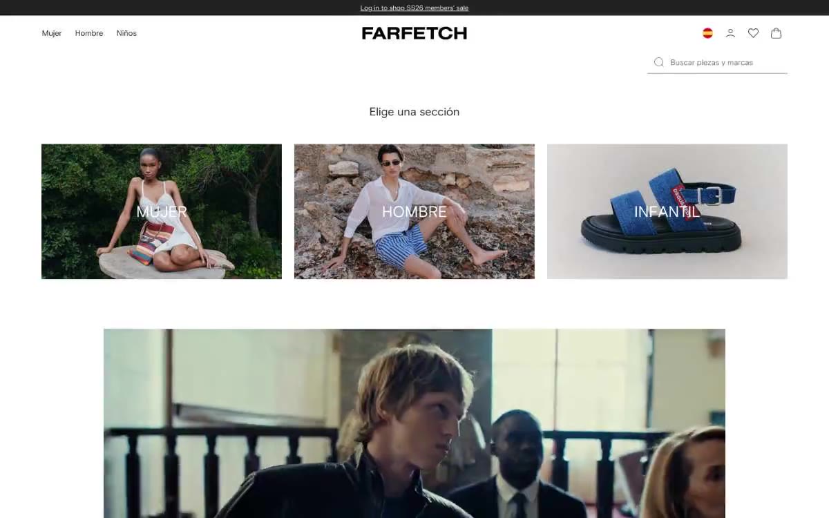
ARKET is a Scandinavian fashion retailer whose digital presence reads as a curated white-gallery space: bone-white canvases, carbon-black type, hairline borders, and no color anywhere except inside the photography itself. Typography pairs a quiet humanist sans with a small-caps monospace that labels editorial cards like museum wall text, reinforcing the art-direction-over-advertising voice. Interactive elements are sharp (2px corners), flat, and rely on inversion rather than color for emphasis — a solid black button sits beside an outlined one at the same height. The system prizes restraint: generous whitespace, no gradients, minimal elevation, and a single nearly invisible blue accent reserved for links. Every screen should feel like a printed lookbook page — spacious, monochrome, and let the imagery do the chromatic work.