# Microsoft AI — Style Reference
> old library at golden hour

**Theme:** mixed

Source measurements are normalized; roles and recommendations are interpreted. Font summary lists are independent, not paired by position. HTML examples are reconstructions, not source components.

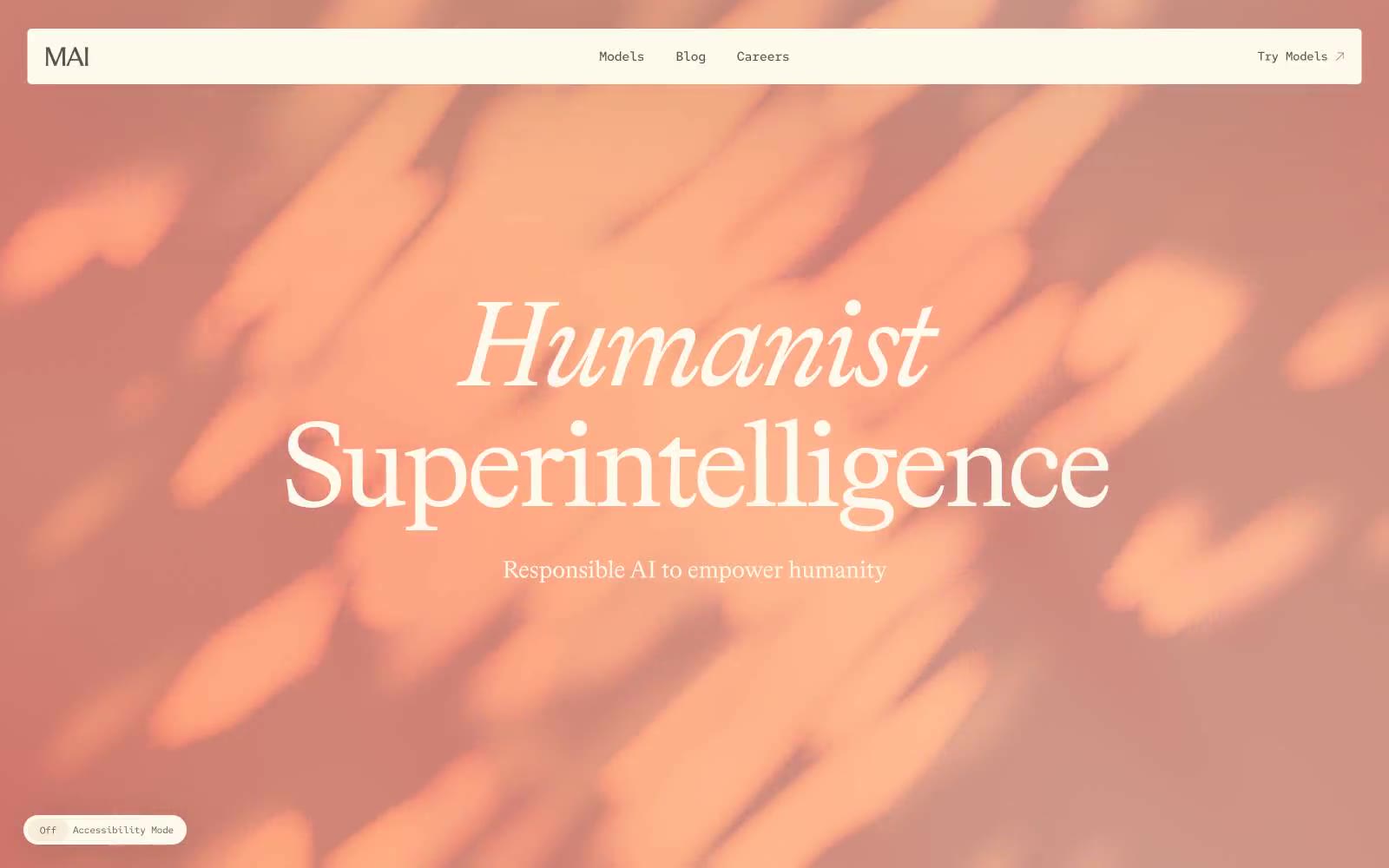
Microsoft AI reads like a rare-press manuscript bound in linen — warm parchment canvases, deep ink-teal voids, and oversized serif type that treats the page as editorial space rather than product surface. The palette is almost entirely earth-toned: cream, walnut, faded rose, and a single anchoring deep green-black that appears only in the hero, creating a dramatic chiaroscuro between top-of-page and everything below. Typography is the entire personality: a custom transitional serif (Bradford LL) dominates display and body, carrying italic for emphasis and aggressive negative tracking as sizes grow; a monospace (Red Hat Mono) handles the few UI affordances — tabs, labels, search, accessibility toggle. There are no saturated brand colors, no gradient buttons, no filled CTAs with hue. Action lives in text, in arrow glyphs, and in the giant pill radius that makes every control look like a wax seal on an envelope. The design intentionally avoids shadow and elevation — surfaces are flat planes of warm paper stacked against each other, separated by generous breathing room and the occasional peach wash.