# AI Product Generation — Style Reference
> editorial photography studio on white paper — headline display type as cover, orange as the editor's highlight pen

**Theme:** light

Source measurements are normalized; roles and recommendations are interpreted. Font summary lists are independent, not paired by position. HTML examples are reconstructions, not source components.

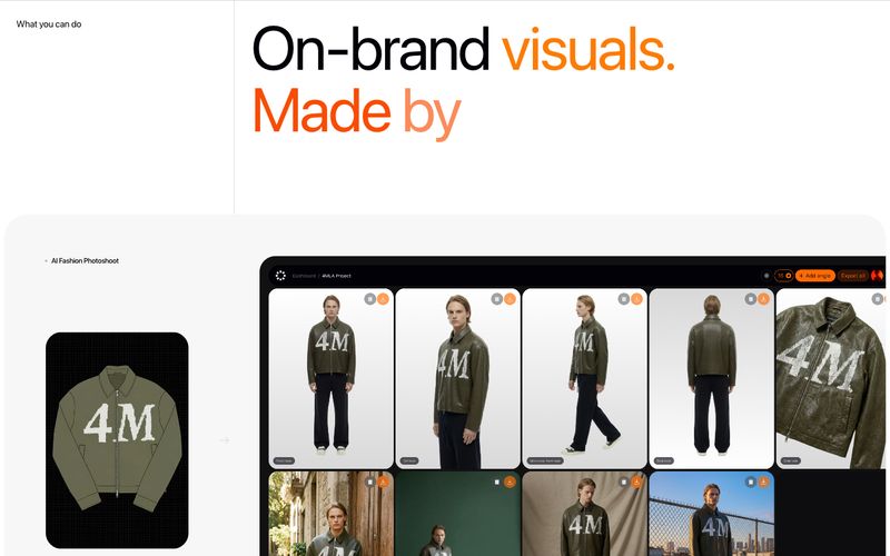
Fourmula is an editorial product-photography studio rendered in code: vast white pages, near-black display type at extreme sizes, and a single disciplined orange accent that reads like editorial highlight pen rather than brand chrome. The system is almost monochromatic — three near-grays carry the entire interface, and color appears only as semantic punctuation inside headlines and gradients. Surfaces are flat and borderless, relying on hairline gray dividers and generous whitespace to separate regions instead of shadow or elevation. Typography is the dominant design move: SF Pro Display at weights 400–500, tracked tight at large sizes, producing headlines that feel like magazine cover titles rather than SaaS hero copy. Components are quiet and minimal — a thin outlined button, a small tag badge, flat cards with generous padding, and a single rounded image corner. The result is a site that treats its product imagery as the spectacle while the chrome recedes.