

ElevenLabs
以轻声标题呈现的温暖奶油色编辑设计。一本包豪斯工作室笔记:蛋壳色纸张、黑色油墨,以及仅在产品展示场景中出现的紫色和橙色火花。
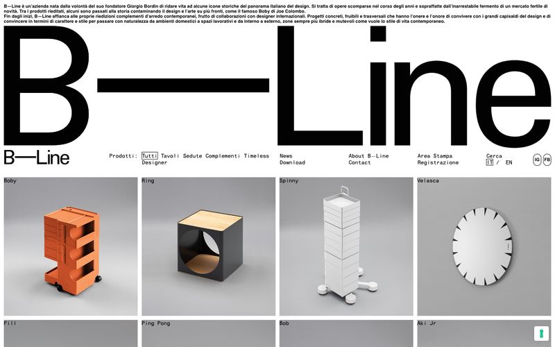

如同等宽排版的编辑式博物馆目录,无彩色排版网格中,文字标志比每个产品都更大。
B—Line像一本编辑式产品索引,而非营销网站;任何产品图像出现之前,品牌名称本身就以建筑尺度成为首屏主角。调色板刻意无彩色,纯黑、白和唯一中灰承载每个文字、边框与表面决策。HELVMONO等宽排版主导正文、导航与元数据,使每个标签都像博物馆目录条目。产品摄影像物体记录,统一灰色摄影棚背景、紧密裁切,没有任何生活方式摆拍。表面保持平面,没有抬升、装饰渐变或圆角,仅少数链接采用细微圆角处理。结果是带瑞士气质的极简主义,色彩与装饰的缺席本身就是宣言。
查看原始网站以轻声标题呈现的温暖奶油色编辑设计。一本包豪斯工作室笔记:蛋壳色纸张、黑色油墨,以及仅在产品展示场景中出现的紫色和橙色火花。
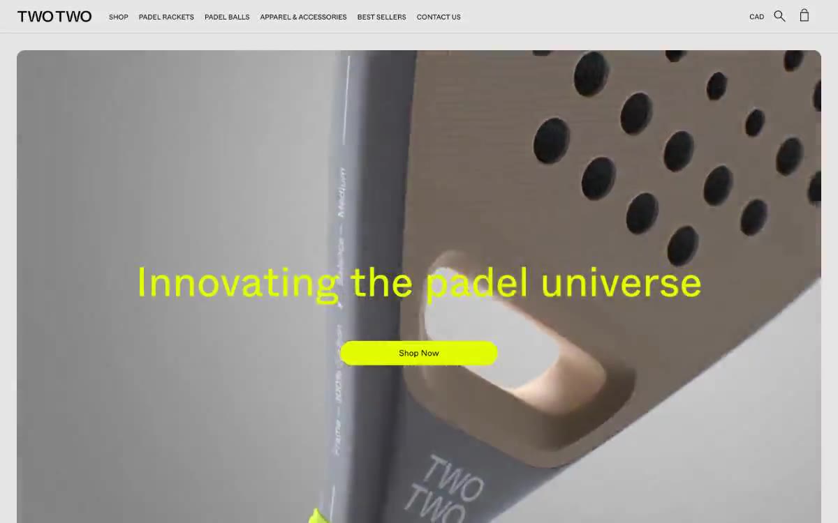

单色混凝土上的电压青柠:黑白编辑网格中唯一的霓虹重击。
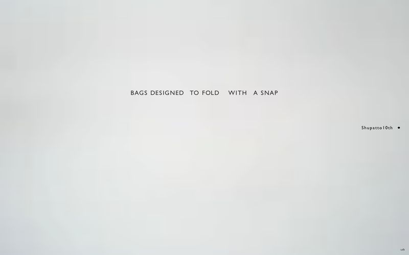

白色大理石上的博物馆展柜。
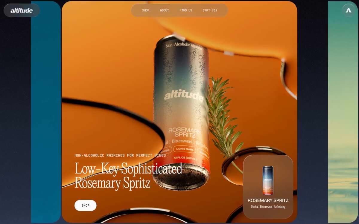

如同单色编辑式跨页。想象一张时尚杂志跨页,除产品摄影外去掉全部彩色,所有叙事都由文字和留白承担。
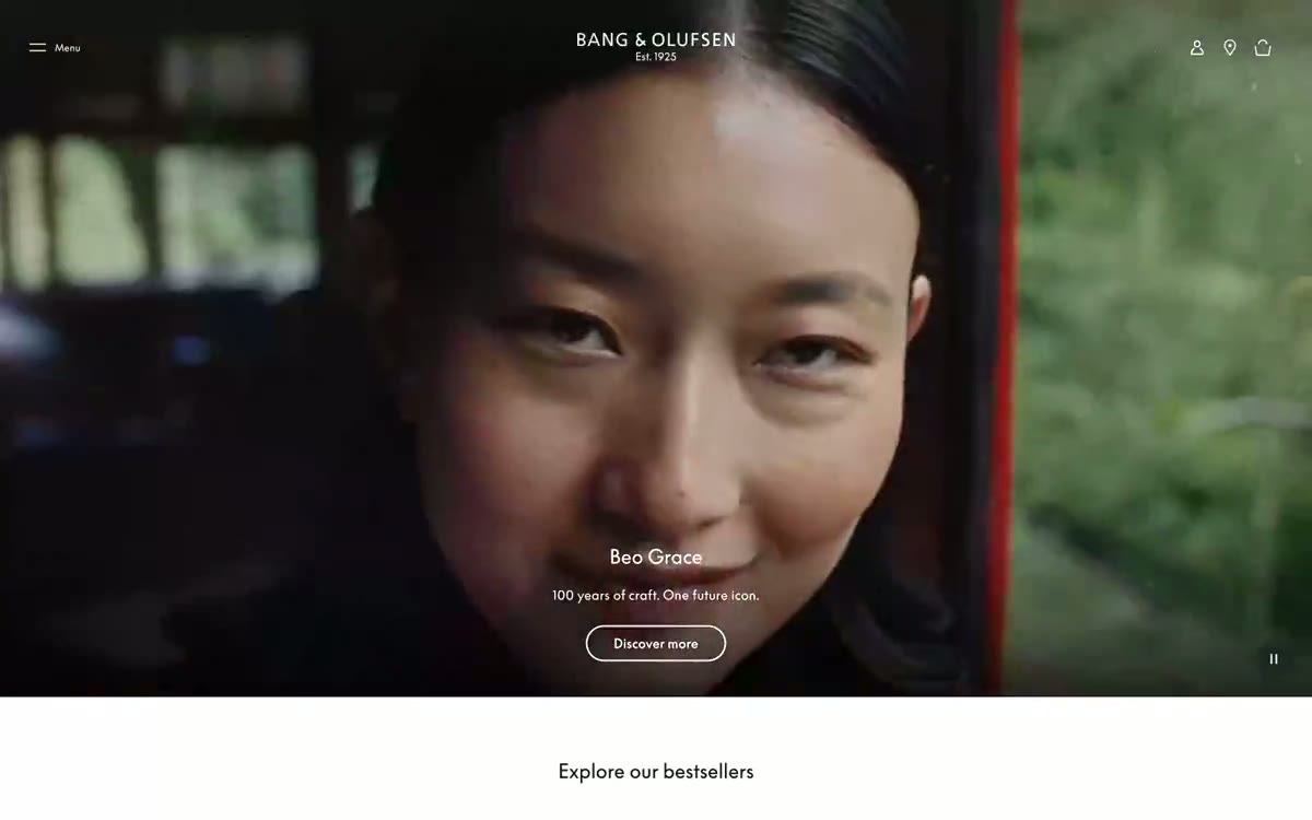

斯堪的纳维亚风格的瓷画廊。当 B&O 页面变暗,产品如同在深夜壁龛中被点亮的雕塑;当页面变亮,产品漂浮于纯白丝质背景上,其他元素均不抢眼。
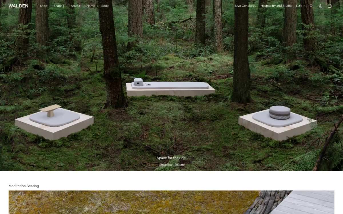

静止的林地:每个产品是石头,每个像素是苔藓与静默。