# Juicebox.ai — Style Reference
> Talent command center on cream paper

**Theme:** light

Source measurements are normalized; roles and recommendations are interpreted. Font summary lists are independent, not paired by position. HTML examples are reconstructions, not source components.

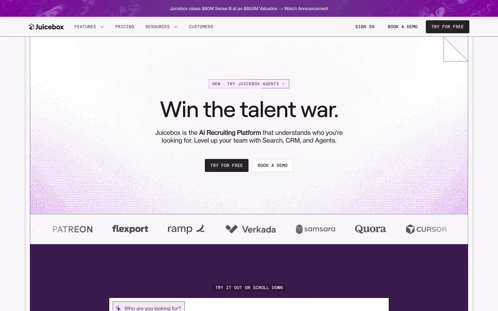
Juicebox operates in a talent-recruiting command center dialect: near-white canvas surfaces, a single saturated royal-purple that floods heroes and product frames, and tight, oversized serifless headlines that feel like executive memos rather than SaaS marketing. The interface is deliberately quiet — hairline borders, 2px radii, mono-spaced technical labels — so that the purple moments (hero washes, active tabs, product frames) feel like voltage jumps against an otherwise grayscale instrument panel. Body copy is set in a grotesque at 14–18px with slightly tightened tracking; display copy uses a neo-grotesque display face with aggressive negative letter-spacing at 40–72px that compresses headlines into confident, compact blocks. Components are compact, rectangular, and unornamented: no rounded pills, no drop shadows, no gradients on controls. Elevation is implied by surface lightness and a single inset shadow reserved for active/pressed states.