# Buddy — Style Reference
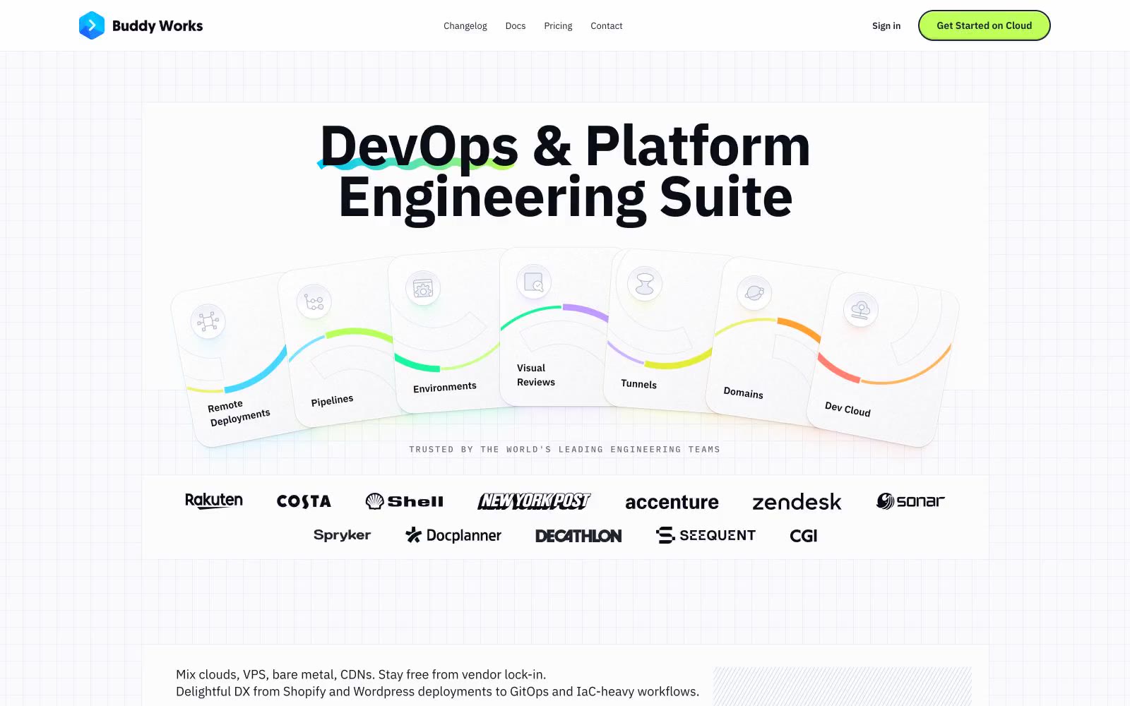
> Engineering blueprint on graph paper. A white drafting surface scored with a faint grid, inked in near-black, punctuated by fluorescent chartreuse annotations and iridescent gradient strokes.

**Theme:** mixed

Source measurements are normalized; roles and recommendations are interpreted. Font summary lists are independent, not paired by position. HTML examples are reconstructions, not source components.

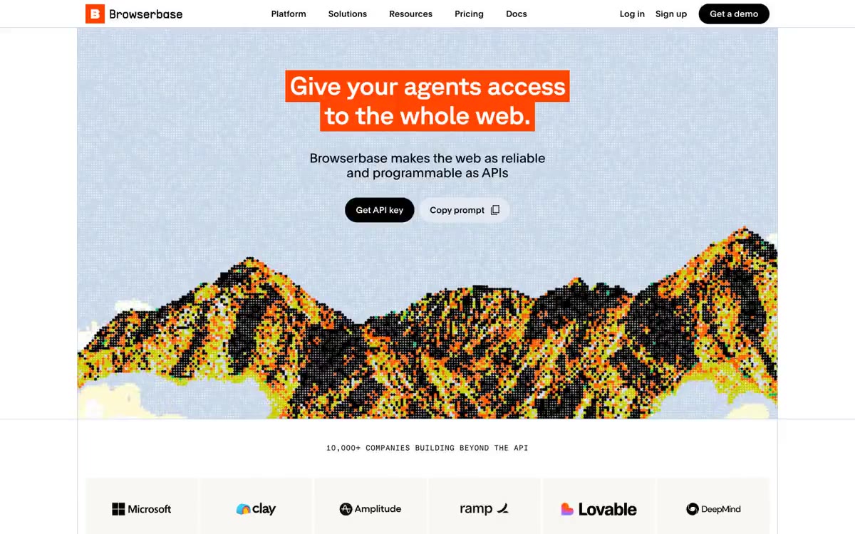
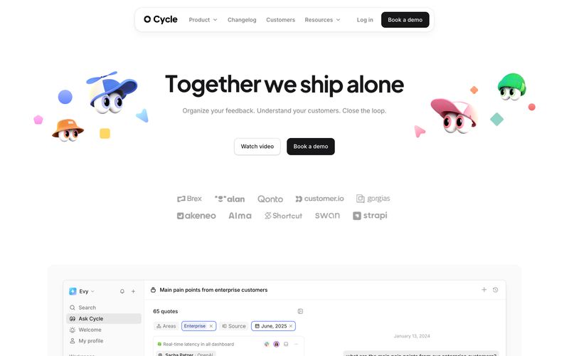
Buddy Works renders as a clean engineering workspace drawn on graph paper — a near-white canvas overlaid with a subtle blueprint grid, deeply saturated near-black ink for type, and one unmistakable lime-green CTA that snaps every action into focus. Color is rationed: 95% of the interface stays achromatic with a navy-ink text system, while vivid chromatic energy is reserved for a lime button, cobalt link accent, and the rainbow radial-gradient swooshes that underline headlines and trace the edges of feature cards. Surfaces are whisper-soft — white cards, hairline slate borders, layered translucent shadows tinted with brand hues — and the only heavy shadows are cast by product screenshots and elevated testimonial cards. Typography is IBM Plex Sans at comfortable sizes with aggressive negative tracking on the display sizes, giving headlines a tightened, engineering-specimen feel rather than a marketing-brochure feel. Component geometry is built on two pillars: 56px-radius pill buttons and 24px-radius cards, with a few 14px-radius inner cards for tighter clusters. The result is a system that reads as drafted, measured, and instrumented — a tool surface, not a landing page.