# Tines — Style Reference
> lavender observatory under glass — soft warm white, deep violet edges, specimen cards in pastel tints

**Theme:** light

Source measurements are normalized; roles and recommendations are interpreted. Font summary lists are independent, not paired by position. HTML examples are reconstructions, not source components.

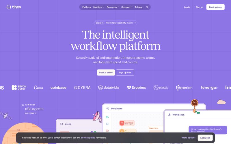
Tines is a violet-drenched observatory: a soft, warm-white canvas (#fcf9f5) layered with a deep iris (#4d3e78) that saturates borders, text, and iconography like ink on parchment. Reckless serif headlines sit at whisper-weights (300) with tight negative tracking, while Roobert sans carries all UI at near-equal weight. The system replaces typical flat SaaS chrome with hand-drawn whimsy: illustrated clouds, paper planes, and sprouts float across sections as decorative atmosphere. Cards are the signature element — pastel-tinted backgrounds paired with vivid, saturated 2px borders in pink, orange, green, or teal, creating a 'lab notebook' feeling where each story is its own labeled specimen. Buttons are quietly confident: ghost outlines on hero CTAs, pill-shaped deep-violet fills for booking, and zero drop-shadow elevation throughout.