# Chat for impact — Style Reference
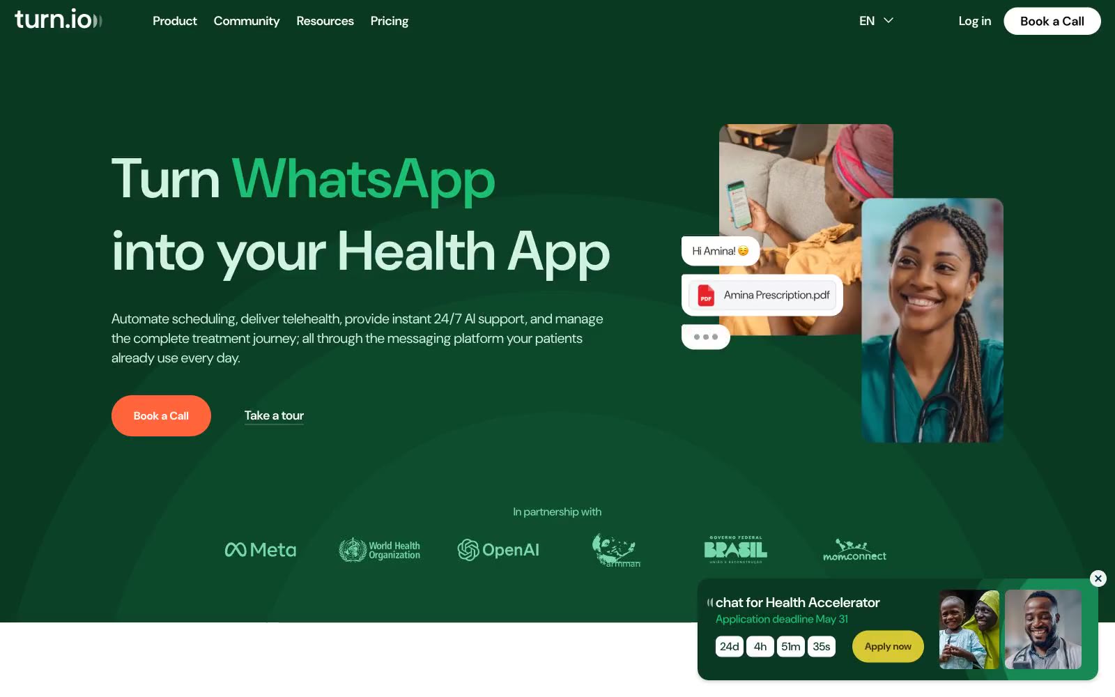
> forest-green clinic with pastel rooms

**Theme:** light

Source measurements are normalized; roles and recommendations are interpreted. Font summary lists are independent, not paired by position. HTML examples are reconstructions, not source components.

Turn.io runs on a warm, healthcare-optimistic visual system: a deep forest green acts as the dominant brand surface and hero canvas, while soft pastel washes (mint, lavender, peach, cream, sky) create section rhythm like colored rooms in a clinic. The single vivid coral CTA (#ff643b) is the only high-saturation action color and it sits on a near-monochrome field, so every 'Book a Call' reads as the obvious next step. Typography is DM Sans everywhere, pushed to enormous display sizes (69–116px) with tight negative tracking, which gives even the hero a conversational softness rather than corporate weight. Components stay flat and borderless — the system communicates through color blocks and 16–24px rounded cards, not shadows or chrome. Pastel feature cards and a lavender page canvas give the whole site a hand-drawn, almost editorial warmth, while the green hero and purple toolkit band inject the brand's two anchor colors at full saturation.