# Headspace — Style Reference
> Sunlit wellness retreat on warm paper

**Theme:** light

Source measurements are normalized; roles and recommendations are interpreted. Font summary lists are independent, not paired by position. HTML examples are reconstructions, not source components.

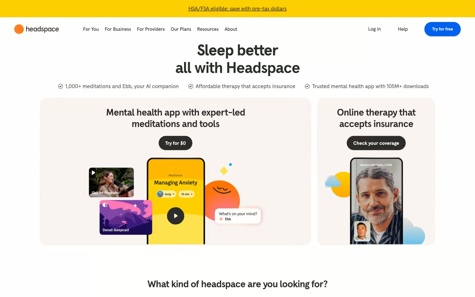
Headspace lives in a sunlit wellness retreat on warm paper: a cream canvas (#f9f4f2) that breathes, bold rounded surfaces, and tightly tracked headlines that feel confident and calm rather than clinical. The palette is predominantly achromatic with a warm dark text scale (#2d2c2b, #44423f) that never goes cold-black on body copy, and color is deployed as deliberate emotional punctuation — Headspace yellow for energy, electric blue for the primary signup, and a deep violet for contemplative moments. Radii are generous: 16-32px on cards and feature blocks, 8px on buttons and inputs, and 9999px (800px in tokens) for pills and circular elements, giving every surface a soft, huggable quality. Typography is a single custom geometric sans (Headspace Apercu) at weights 400/500/700 with negative letter-spacing that tightens as sizes scale up, producing headlines that feel sculpted rather than shouted.