# ACCOMPANY — Style Reference
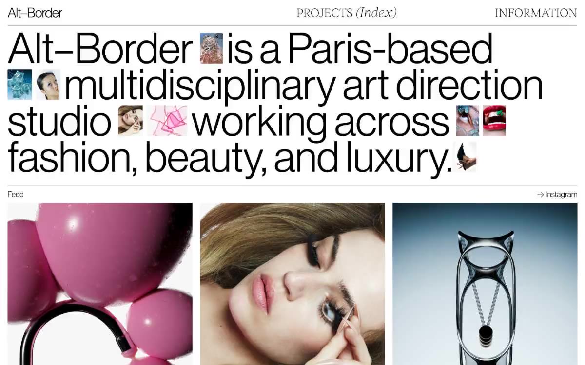
> Editorial broadside on bone canvas. A monochrome typographic system where a 80px light serif headline does all the emotional work and everything else stays out of its way.

**Theme:** light

Source measurements are normalized; roles and recommendations are interpreted. Font summary lists are independent, not paired by position. HTML examples are reconstructions, not source components.

ACCOMPANY runs on a monochrome editorial system: pure black on bone white, with no shadows, no gradients, no accent color. A custom light serif (Items-Light) carries the entire brand voice at 80px display scale with aggressive 0.90 line-height, while a medium grotesque (SyndicatGroteskMedium) handles everything from 44px subheads down to 16px body copy. Hierarchy is built entirely through type size, weight contrast (light serif vs medium grotesque), and whitespace — the system behaves like a museum monograph or fashion broadside, assuming the work itself provides the color. Components are architectural skeletons: hairline rules, uppercase micro-labels, generous gutters, and flat image frames. Color enters only through photography.