# Hugo & Marie — Style Reference
> Monochrome gallery catalog — editorial photography mounted on infinite white, framed by whisper-thin serif.

**Theme:** light

Source measurements are normalized; roles and recommendations are interpreted. Font summary lists are independent, not paired by position. HTML examples are reconstructions, not source components.

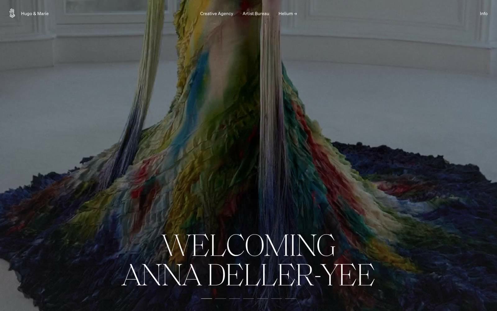
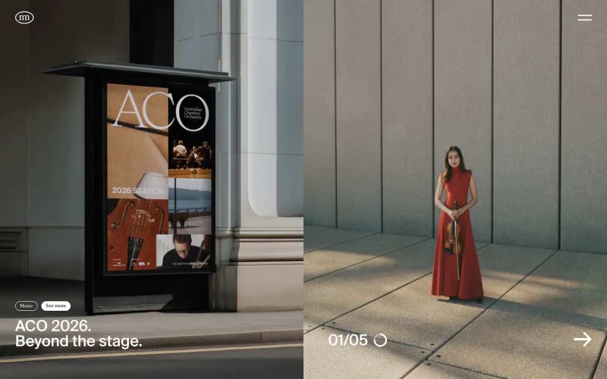
Hugo & Marie operates as a curatorial monochrome canvas: pure white negative space frames dramatic full-bleed editorial photography, with content living in the tension between near-black ink and paper. Typography carries all the personality — an ultralight serif display (weight 100, 100px) sets ceremonial headlines that feel like gallery wall text, while a restrained neo-grotesque sans (soehne, weights 300/400) handles everything from navigation to body copy. The interface refuses decorative chrome: no filled buttons, no color accents, no shadows — navigation is text-with-arrow, badges are hairline pills, and section dividers are single-pixel rules. This is a portfolio-first system where the artists' imagery is the only chromatic event, and the UI must vanish around it.