# Fruitful — Style Reference
> Sun-drenched kitchen herb garden — warm cream surfaces, single deep green accent, botanical softness throughout.

**Theme:** light

Source measurements are normalized; roles and recommendations are interpreted. Font summary lists are independent, not paired by position. HTML examples are reconstructions, not source components.

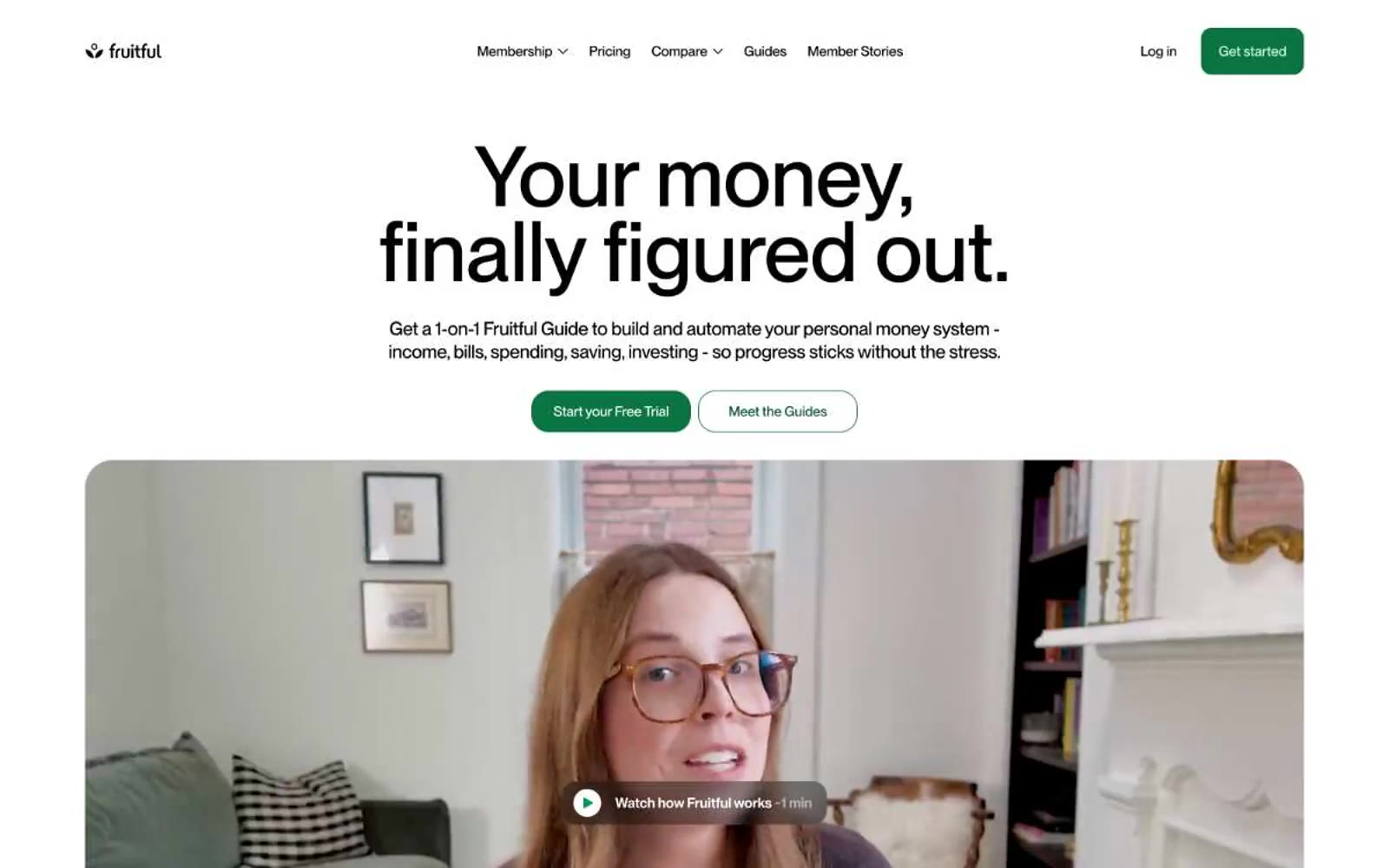
Fruitful operates as a sunlit kitchen-table financial practice: warm cream surfaces replace the cold grays of typical fintech, and a single deep forest green acts as the only chromatic voice. Type carries the weight — large, tight-tracked display sizes (up to 91px) that feel hand-set rather than engineered, grounding an otherwise gentle interface. Components are rounded and soft (12px on most containers, 80px on pills), with photographic portraits of real Guides in large rounded frames replacing the abstract product shots common in the category. Elevation is nearly invisible — a single multi-layer shadow reserved for the deepest cards — and borders are thin and quiet. The overall rhythm is: generous whitespace, centered headline bands, 2–3 column card grids, and a warm-but-bright palette that keeps the experience feeling like advice from a friend, not a dashboard.