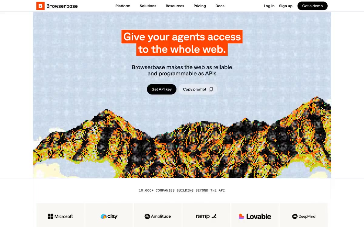
# Lithic — Style Reference
> Warm marble briefing room for card architects — confident, earthy, deliberate.

**Theme:** light

Source measurements are normalized; roles and recommendations are interpreted. Font summary lists are independent, not paired by position. HTML examples are reconstructions, not source components.

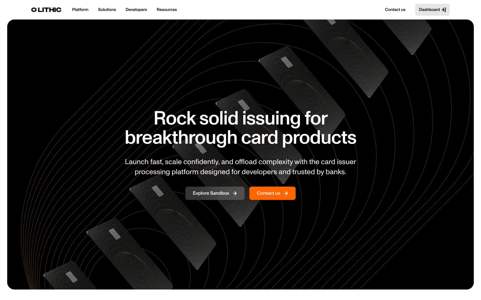
Lithic operates as a warm briefing room for card-issuing architects: cream marble surfaces, a single confident sans-serif, and three deliberate accent colors that each carry distinct semantic weight. The page alternates a deep black hero — a vault-like stage for physical card imagery and concentric arc patterns — with generously spaced warm-neutral sections where orange, violet, and green act as functional punctuation rather than decoration. Components feel editorial: thin hairline borders, 24px rounded corners, deep floating shadows on elevated cards, and cream-tinted surfaces that stack into a quiet hierarchy. Density is comfortable, rhythm is built from 8px and 24px increments, and the single Monument Grotesk family at weights 400/500 is allowed to carry every tonal shift from whisper to emphasis through size and tracking alone.