# Sleeve — Style Reference
> floating dock on marble

**Theme:** light

Source measurements are normalized; roles and recommendations are interpreted. Font summary lists are independent, not paired by position. HTML examples are reconstructions, not source components.

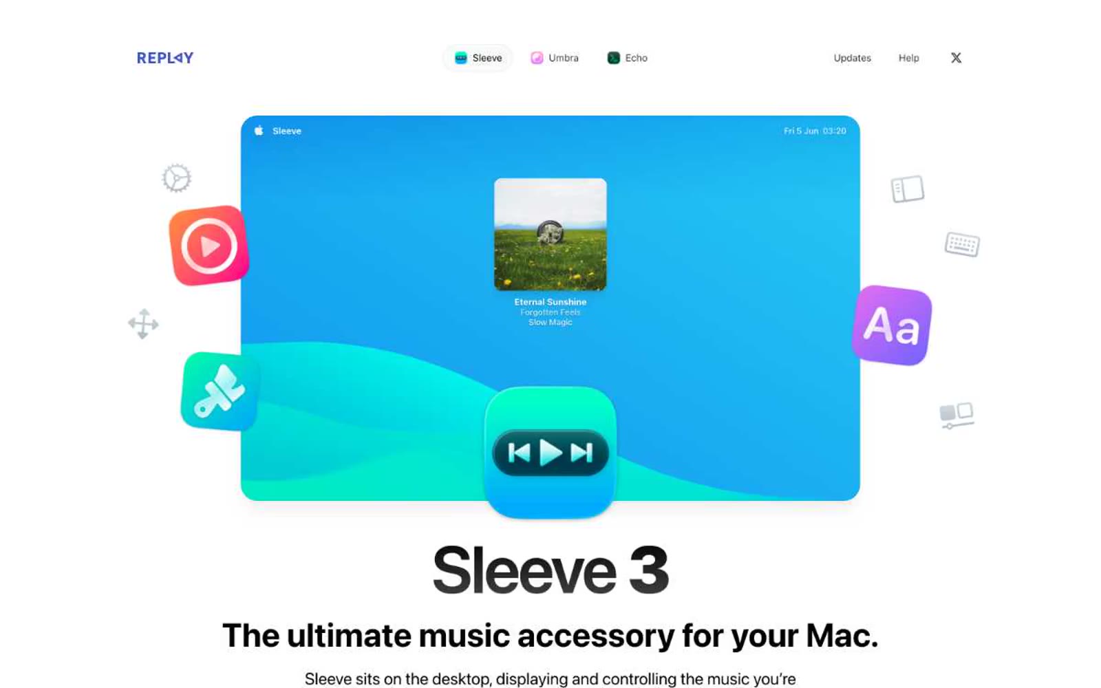
Sleeve's site reads like a macOS product page composed in a gallery: an infinite white canvas, a single hero product shot floating with app-icon satellites orbiting it, and typography that does all the work. The palette is nearly monochrome — black, white, and a hairline gray border are the only structural colors — while the only chromatic energy comes from the app's own blue gradient and a small set of colorful system icons used as decorative punctuation. Headlines are massive and tight-tracked (96px display at -0.025em letter-spacing, 48px section headings), body text is system-sans at 15-18px, and micro-labels like 'THEMING' and 'FEATURE LIST' use 0.05em tracking to whisper rather than shout. Components are soft and chunky: 24px card radii, 9999px pill buttons, inset 1px borders at 0.05 opacity instead of heavy shadows. The design language is confidence through restraint — no gradients on UI, no color on buttons, just typographic weight and generous breathing room carrying every screen.