# Superlist — Style Reference
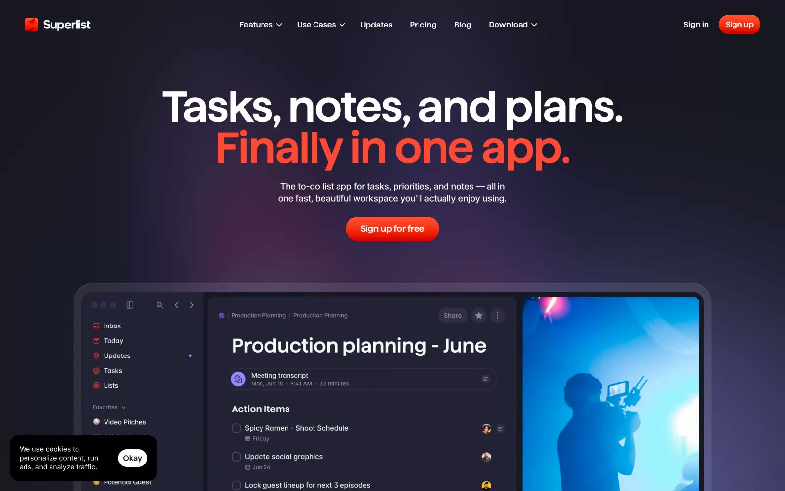
> midnight workspace with coral embers — a quiet aubergine app surface where one warm orange spark signals every action

**Theme:** dark

Source measurements are normalized; roles and recommendations are interpreted. Font summary lists are independent, not paired by position. HTML examples are reconstructions, not source components.

Superlist uses a midnight-violet productivity language: deep aubergine canvas, warm coral as the single ignition color, and oversized sans-serif headlines that carry the entire mood. The interface feels like a focused late-night workspace — quiet, layered, and confident, with color appearing only as functional punctuation on CTAs, active states, and key highlights. Surfaces stack in subtle purple-tinted darks (#181824 → #26253b), avoiding pure black to keep depth feeling warm rather than clinical. Components are generously rounded (20px cards, pill buttons), softly shadowed, and breathe through comfortable 10–16px gaps rather than tight grids. The headline voice is everything: weight 600 at 70–88px with tight -0.02em tracking treats copy as typography, not interface text — it's closer to editorial than SaaS.