# ProtoPie — Style Reference
> sunlit prototyping workshop with violet ink — a designer's clean white drafting table where one electric purple pencil marks every interactive idea.

**Theme:** light

Source measurements are normalized; roles and recommendations are interpreted. Font summary lists are independent, not paired by position. HTML examples are reconstructions, not source components.

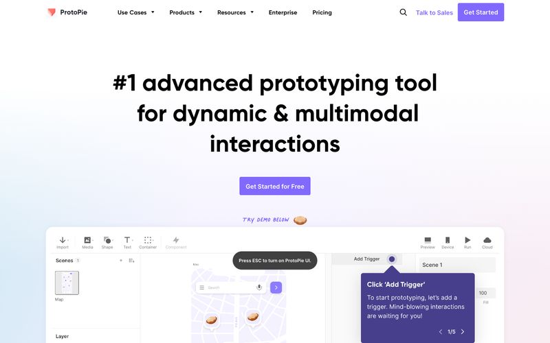
ProtoPie uses a sunlit prototyping-workshop language: a white canvas, near-black ink, and one confident violet that functions as the only chromatic voice in the system. Display type is set in Gilroy at generous sizes (48–62px) with weight 700, giving headlines a friendly, designer-made feel rather than a corporate one. The interface stays predominantly monochrome; violet appears as functional accent on buttons, links, icons, and active states, never as decorative tint. Components feel like tools in a studio tray: 16px card radius, 12px button radius, pill-shaped tags, and a single near-imperceptible shadow that lifts without announcing itself. Backgrounds are white with whisper-soft radial gradient washes in pastel teal and lavender, creating depth that never competes with content.