
Branding
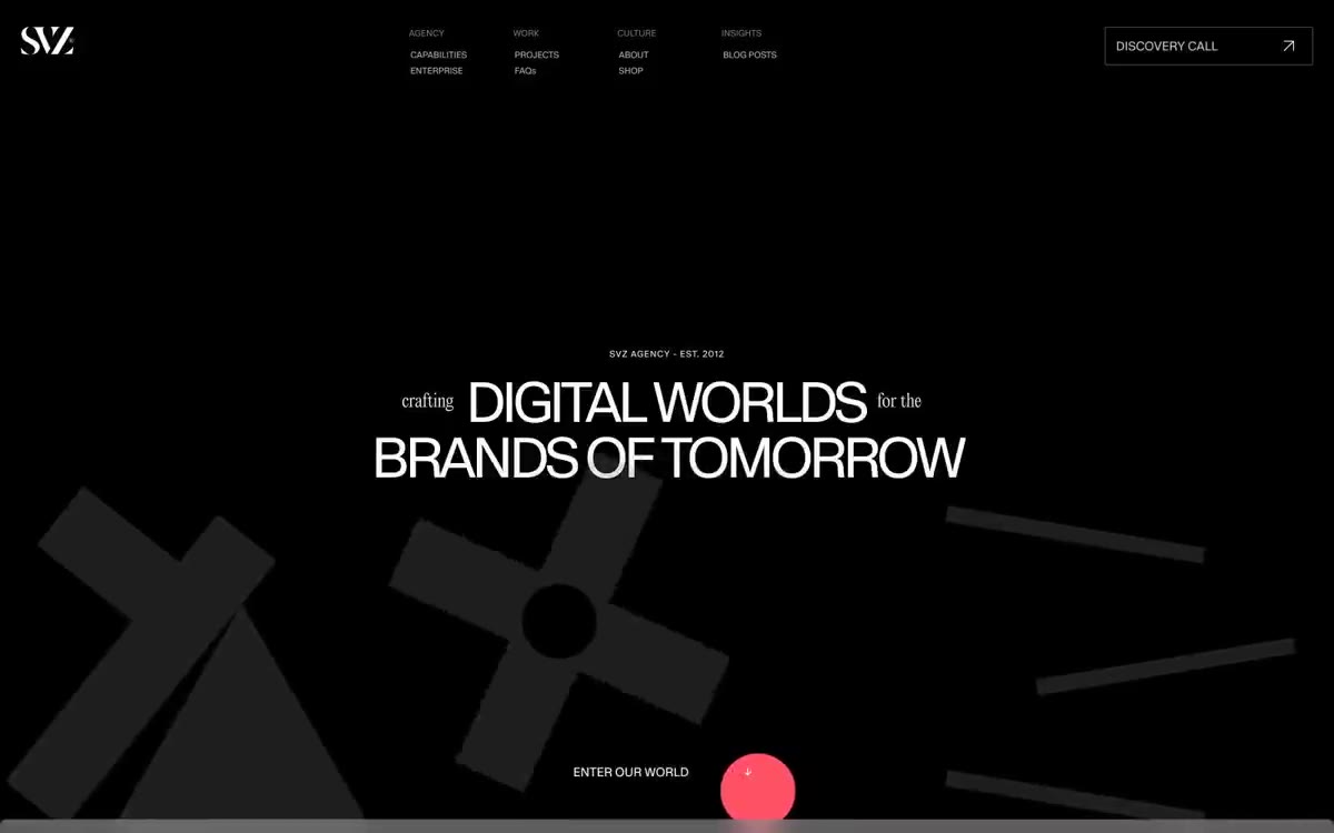
黑色画廊墙面,血红色标点——超大白色显示文字漂浮于类似虚无的深色画布之上,被单个鲜明的红色点缀和戏剧性的装饰性字体打断,整体感觉更像画廊标识而非网页界面。
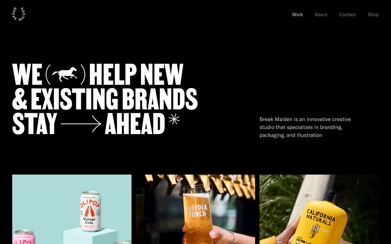

超大白文字刻进黑画廊墙。唯一紧缩展示字体以 150px 坐在留白海中,周围产品照片像杂志跨页排列。
Break Maiden 是一个以黑色画布呈现的创意工作室作品集:纯黑色表面、超大号的白色展示文字,以及如精心策划的印刷跨页般呈现的产品影像。视觉系统刻意保持单色,并以强势的排版表达个性:唯一一款定制展示字体 Martin 以接近广告牌的尺度承担全部情感表达;而克制的新无衬线字体 America 则用于导航、正文和图注。页面像一座画廊:项目图块排列在不规则的三列网格中,栏间距宽裕,让产品摄影承担界面本身不使用的色彩。界面框架本身没有按钮、渐变、阴影或装饰;系统的辨识度来自留白与巨大标题之间的对比,而非色板的丰富层次。
查看原始网站黑色画廊墙面,血红色标点——超大白色显示文字漂浮于类似虚无的深色画布之上,被单个鲜明的红色点缀和戏剧性的装饰性字体打断,整体感觉更像画廊标识而非网页界面。
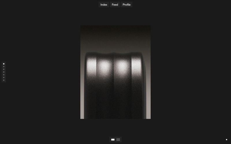

闭馆后的画廊,展示日光般的跨页。
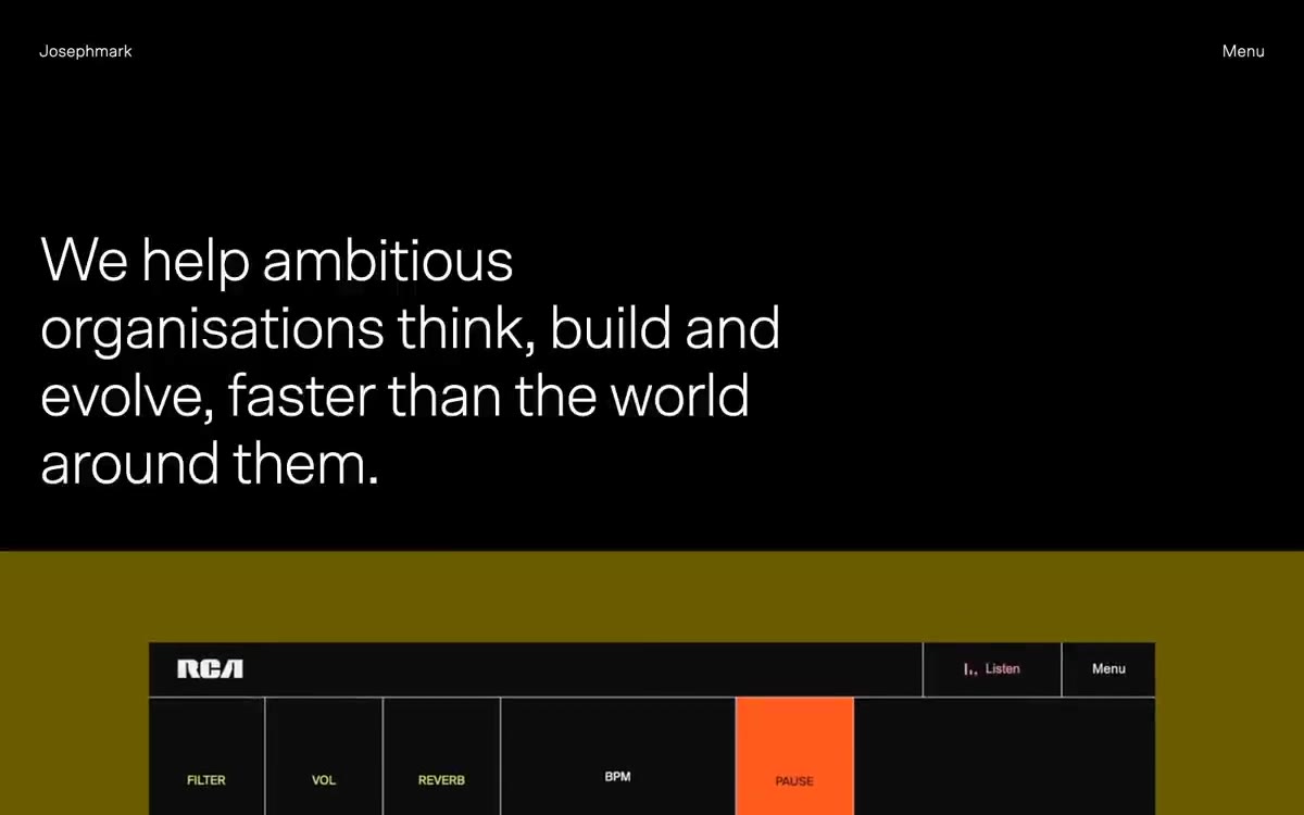

午夜编辑画廊。单色墙面,暖色聚光灯,超大无衬线字体漂浮于负空间中。
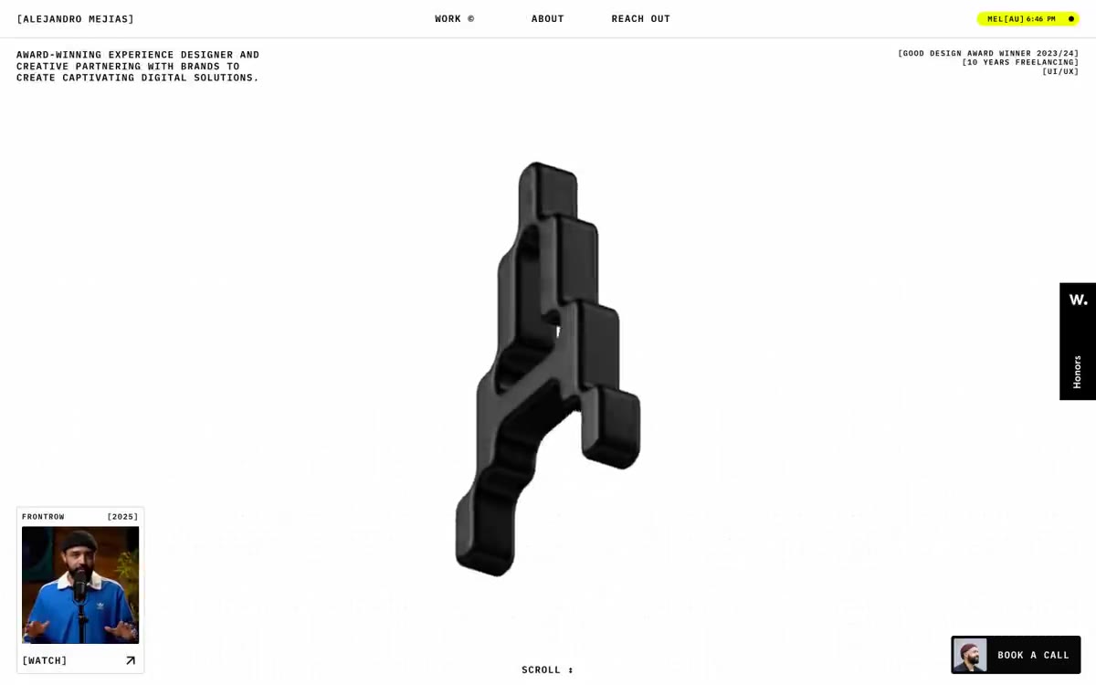

酸色照明的粗野主义工作室,酸黄与Obsidian、Bone White相对。
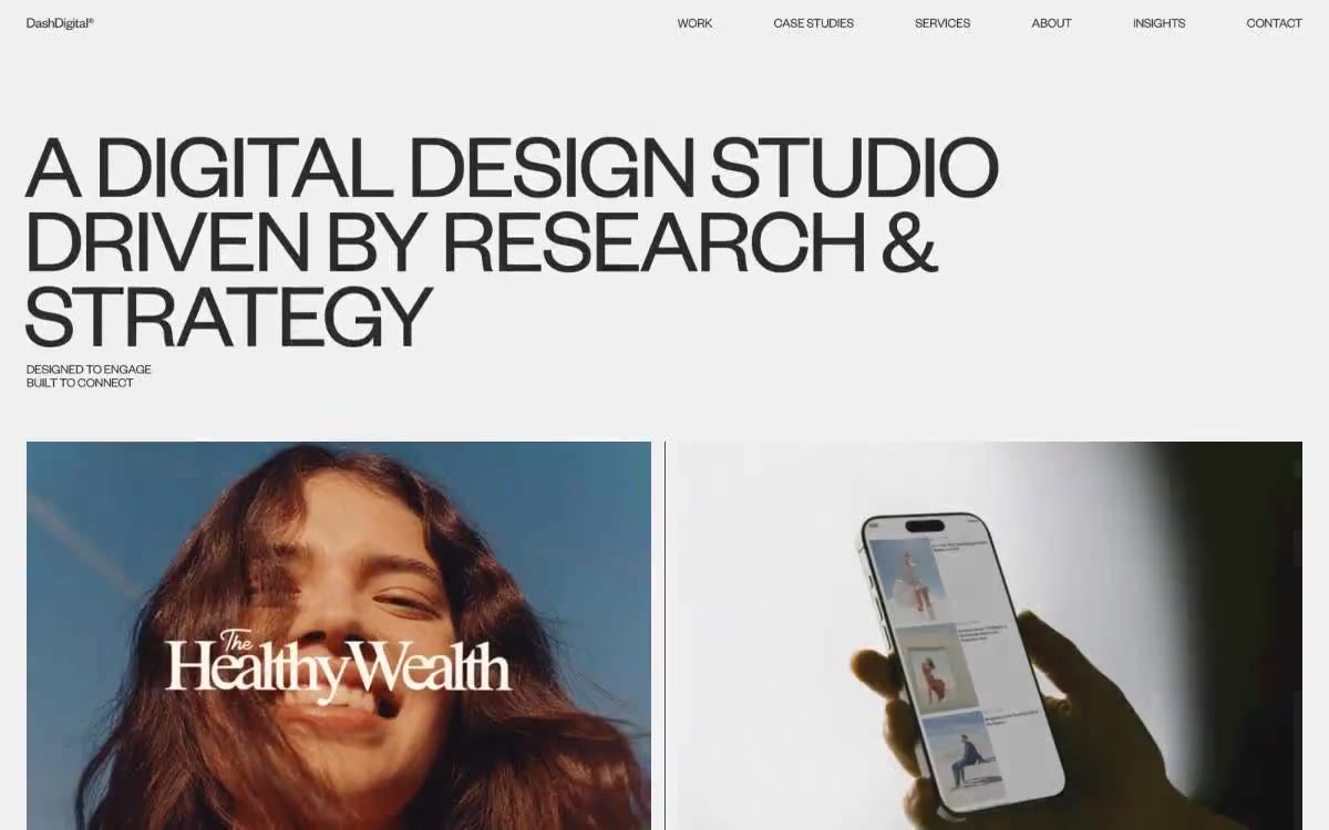

暖色纸张上的编辑型博物馆。画廊中,极轻字重的巨大文字悬浮在近白色墙面上,满幅产品摄影承担全部表达。
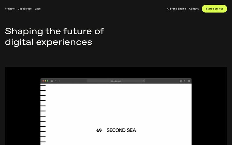

黑色画廊中带有青绿色亮点。黑暗的虚空中,一个霓虹绿的箭头刺破寂静,所有内容由温暖的米白字体承载,以超大尺寸的编辑风格标题呼吸而出。