# Vercel — Style Reference
> Typeset terminal on white paper

**Theme:** light

Source measurements are normalized; roles and recommendations are interpreted. Font summary lists are independent, not paired by position. HTML examples are reconstructions, not source components.

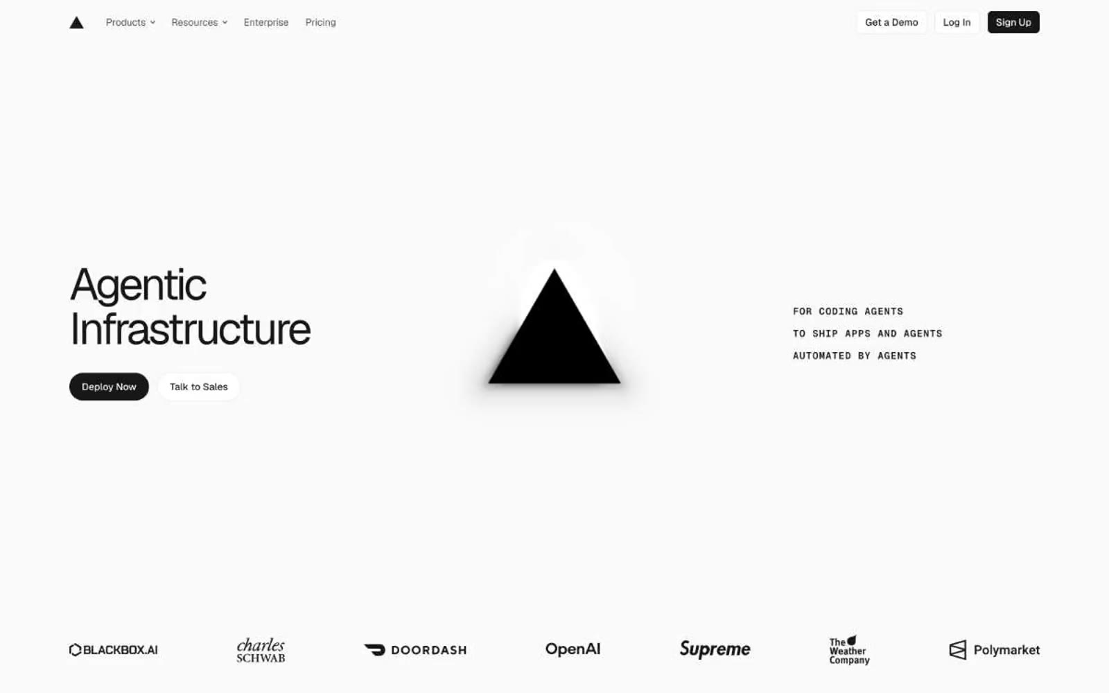
Vercel's design system is an exercise in disciplined monochrome: a near-white canvas (#fafafa), black typography, hairline borders, and the complete absence of decorative color. The visual language reads like a developer terminal rendered in print — Geist Sans whispers at hero scale with weight 400-450 and -0.06em tracking, while Geist Mono stamps labels, metadata, and code samples in 11-13px caps. Buttons are sharp 6px-radius pills or rectangles in pure black-on-white or white-on-black. The system trusts contrast and typography hierarchy over color, using the triangle mark (▲) and a two-line wordmark as the only brand ornament. Surfaces stack as #fafafa → #ebebeb → #171717, creating depth through tonal value shifts rather than shadow or color. Every element is built on a 4px grid with compact density, producing an interface that feels like an engineer's notebook — precise, functional, and unafraid of empty space.