# OpenAI — Style Reference
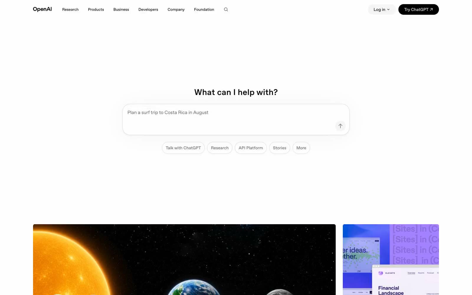
> Research lab notebook at noon.

**Theme:** light

Source measurements are normalized; roles and recommendations are interpreted. Font summary lists are independent, not paired by position. HTML examples are reconstructions, not source components.

OpenAI's interface operates as a typographic, editorial canvas — pure white surfaces, near-black type, and almost no chromatic identity. The system is defined by restraint: the only filled element on the page is the black 'Try ChatGPT' button, which functions as a single period at the end of an otherwise monochrome sentence. Hairline borders at 12% black opacity create structure without weight; cards carry a barely-perceptible 6px radius that whispers geometry rather than announcing it. Typography does the heavy lifting: a custom sans (OpenAI Sans) set at a Major Second scale with progressively tighter tracking — -0.03em at display, normal at body — gives headlines a compressed, almost newsprint authority. Components feel deliberately lightweight: pill-shaped controls, ghost buttons, transparent surfaces, and minimal elevation. The visual mood is 'research lab notebook' — quiet, confident, and trusting the reader to focus on content rather than chrome.