# Rox — Style Reference
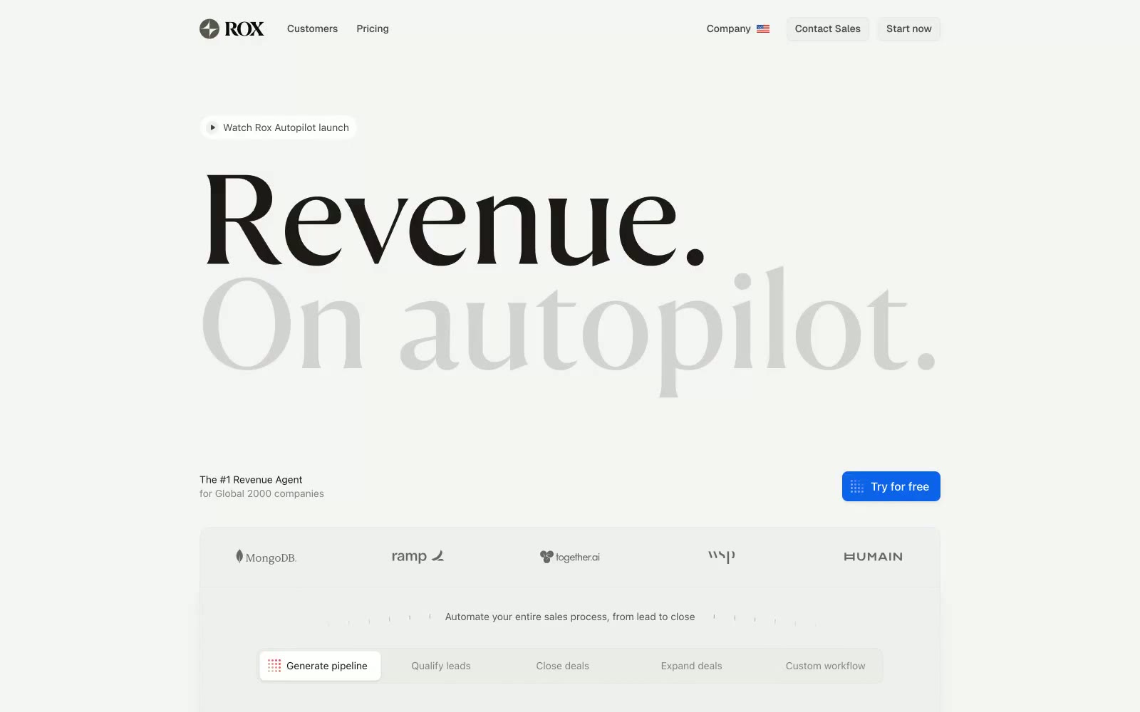
> Editorial broadsheet meets product UI — black serif masthead on warm newsprint, hairline rules, one blue button

**Theme:** light

Source measurements are normalized; roles and recommendations are interpreted. Font summary lists are independent, not paired by position. HTML examples are reconstructions, not source components.

Rox uses a high-contrast editorial language on a warm stone canvas: a single massive serif display headline commands the hero while the product interface speaks in compact, hairline-bordered UI. The palette is near-monochrome — warm grays ranging from #ececea canvas to #1c1917 ink — with one electric blue used exclusively for the primary action button. Status states (Enriching, Engaging, Replying) are the only place where multiple chromatic colors appear, and they appear small, as pill badges, never as decorative washes. The system feels like a financial broadsheet redesigned as software: authoritative type, no rounding softness, minimal shadow, and information density where it counts.