# Sequence — Style Reference
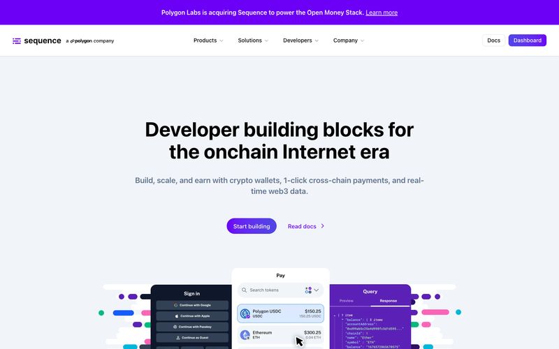
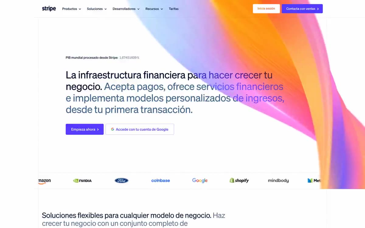
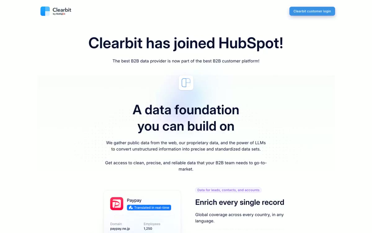
> API console on soft daylight — the interface is the product, and purple is the only power color.

**Theme:** light

Source measurements are normalized; roles and recommendations are interpreted. Font summary lists are independent, not paired by position. HTML examples are reconstructions, not source components.

Sequence presents a light, developer-first visual language built on white surfaces, a confident sans-serif type system, and a single dominant purple that acts as the only serious brand signal on the page. The aesthetic reads like a modern API platform — generous whitespace, compact card grids, hairline borders, and soft elevation rather than heavy shadows or dark mode theatrics. Color is rationed: pages stay largely monochromatic, with purple reserved for primary actions, the logo, and a signature gradient that powers hero treatments and the dashboard call-to-action. Decorative accents in green, blue, and pink appear inside product illustrations and mockups, not in the chrome — they signal 'crypto-native' without competing with the brand. Components are flat and functional, leaning on geometry (8px button radius, 20px card radius, 24px soft shadow) rather than decoration to create rhythm and trust.