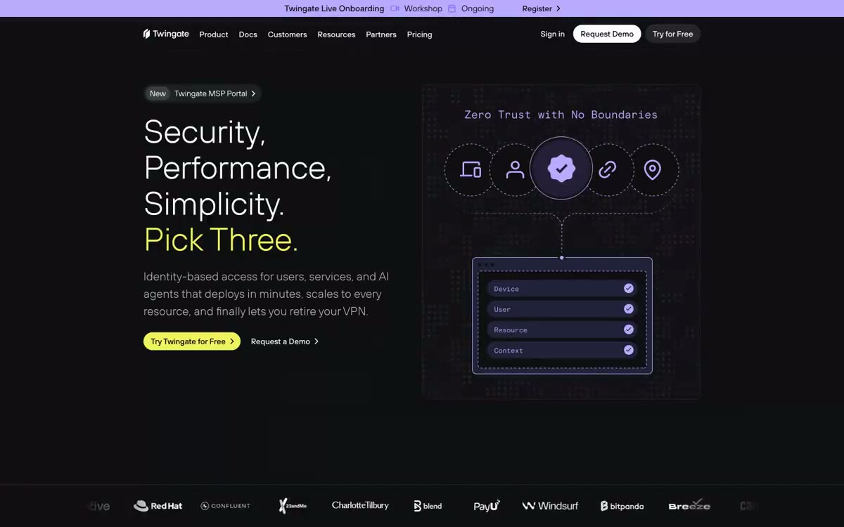

Twingate
带有紫罗兰和黄绿色信号灯的午夜控制室。整个界面位于近黑虚空中,两种强调色像状态LED一样在仪表板组件间脉动,克制、有工程感、略带未来气息,却不炫耀。
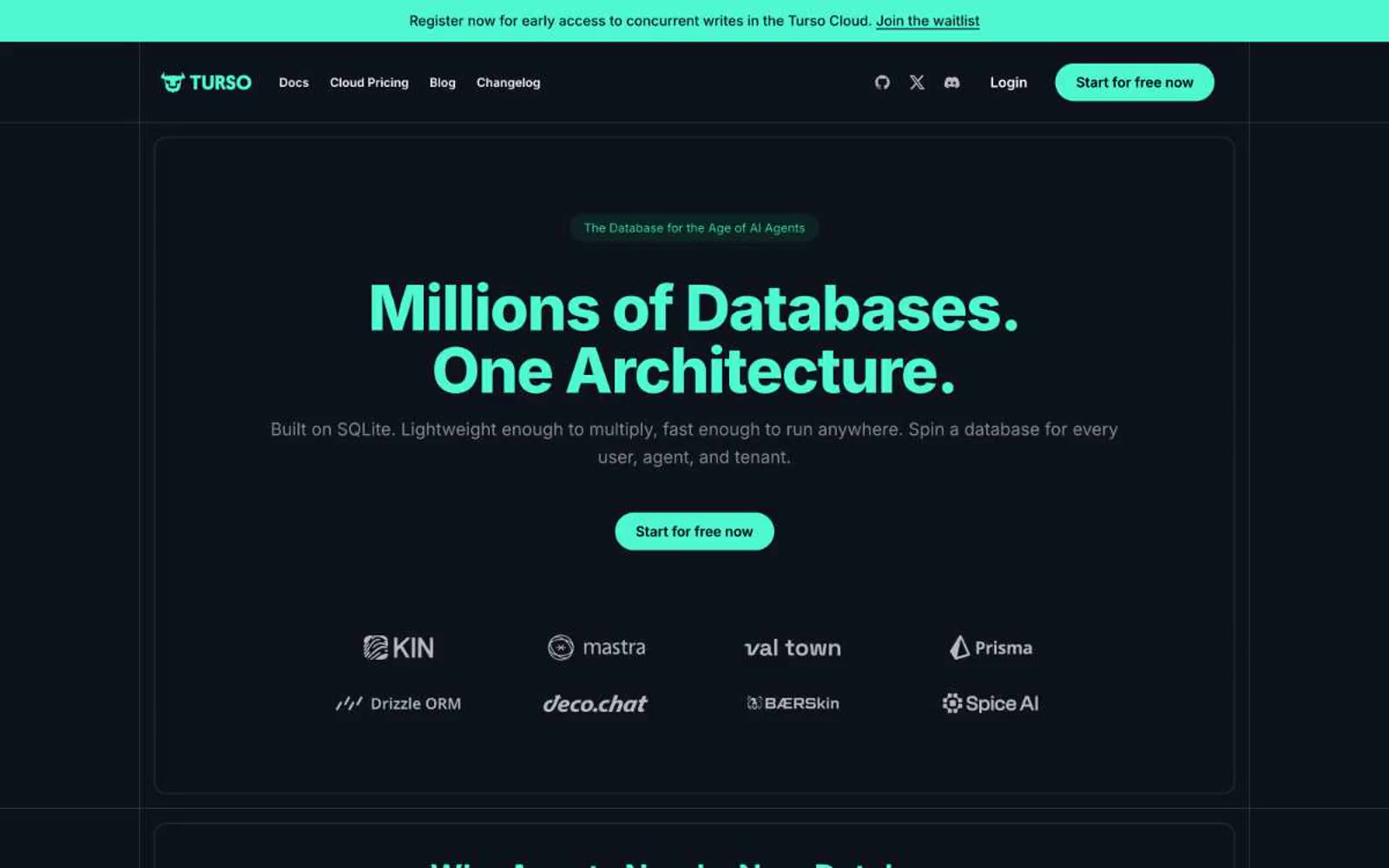

服务器机房中的终端发光效果——钢架机柜上的一盏薄荷绿 LED 灯。
Turso 采用深空开发控制台的视觉风格:近黑色画布带有微妙的青色调,一个鲜明的薄荷绿作为系统‘开机’信号,另配一个电光紫用于 测试版/实验性场景的标注。界面保持安静且以文字为主——白色文本在深色背景上承载内容——而色彩仅作为功能性的强调,用于标题、标签、主要操作按钮以及界定产品卡片的细线边框。组件呈现出轻盈的终端感:胶囊形按钮、带有单像素渐变边框的薄边卡片、带有等宽字体特征的代码片段,以及无阴影的扁平表面。整体风格如同由熟悉终端操作的人所设计的基础设施产品——克制、自信,且毫无争议地偏暗。
查看原始网站带有紫罗兰和黄绿色信号灯的午夜控制室。整个界面位于近黑虚空中,两种强调色像状态LED一样在仪表板组件间脉动,克制、有工程感、略带未来气息,却不炫耀。
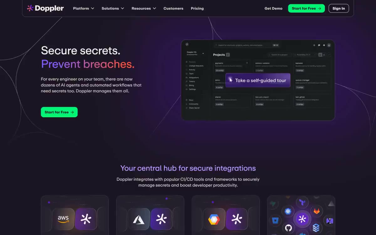

深夜中的紫光保险箱。近黑色底面泛着单一薰衣草信号与绿色确认灯,所有表面仅做轻微圆角处理,以营造可触感的质感。
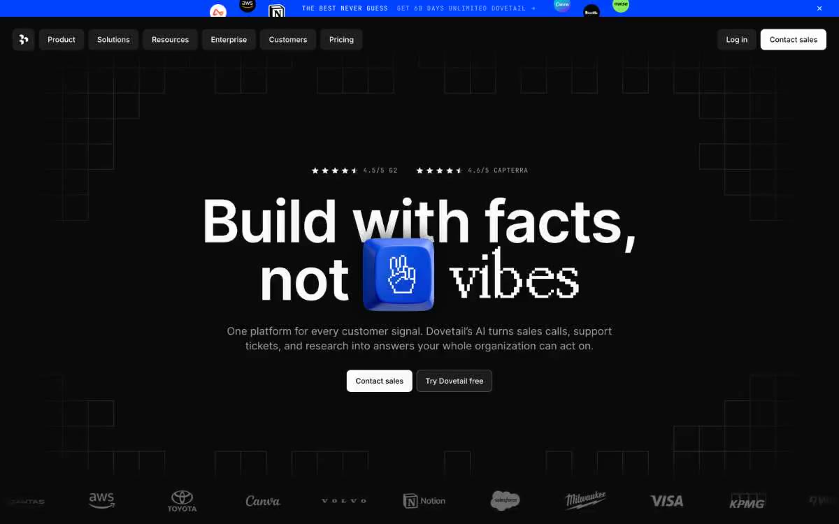

在黑色月亮下呈现蓝图网格——微弱的线条、白色文字,一个紫色亮点。
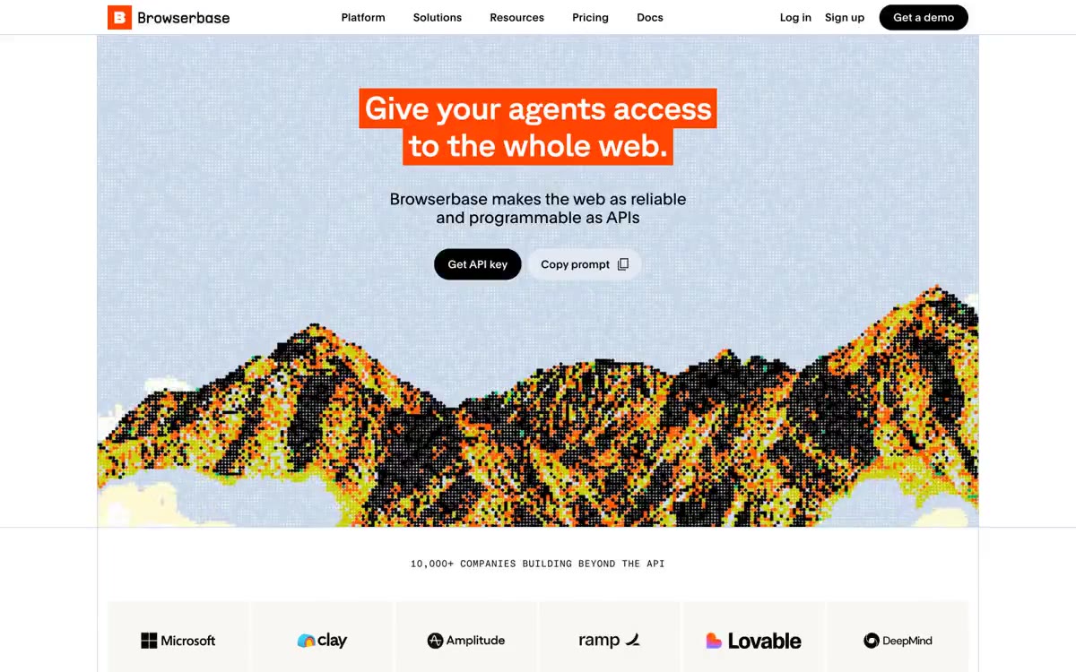

如同编辑式大幅报纸与数据终端相遇:在超大GT Planar标题、柔和粉彩卡片表面和微型等宽元数据构成的近乎单色区域中,唯一热橘色作标点。
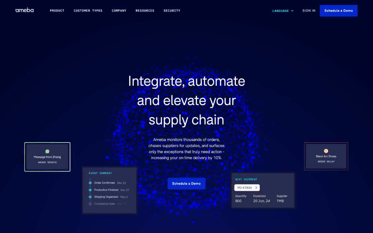

午夜控制室:磨砂玻璃面板内部的电光蓝脉搏。
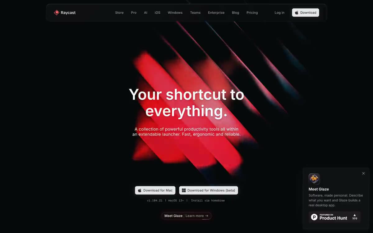

午夜指挥中心,珊瑚霓虹