# Ori — Style Reference
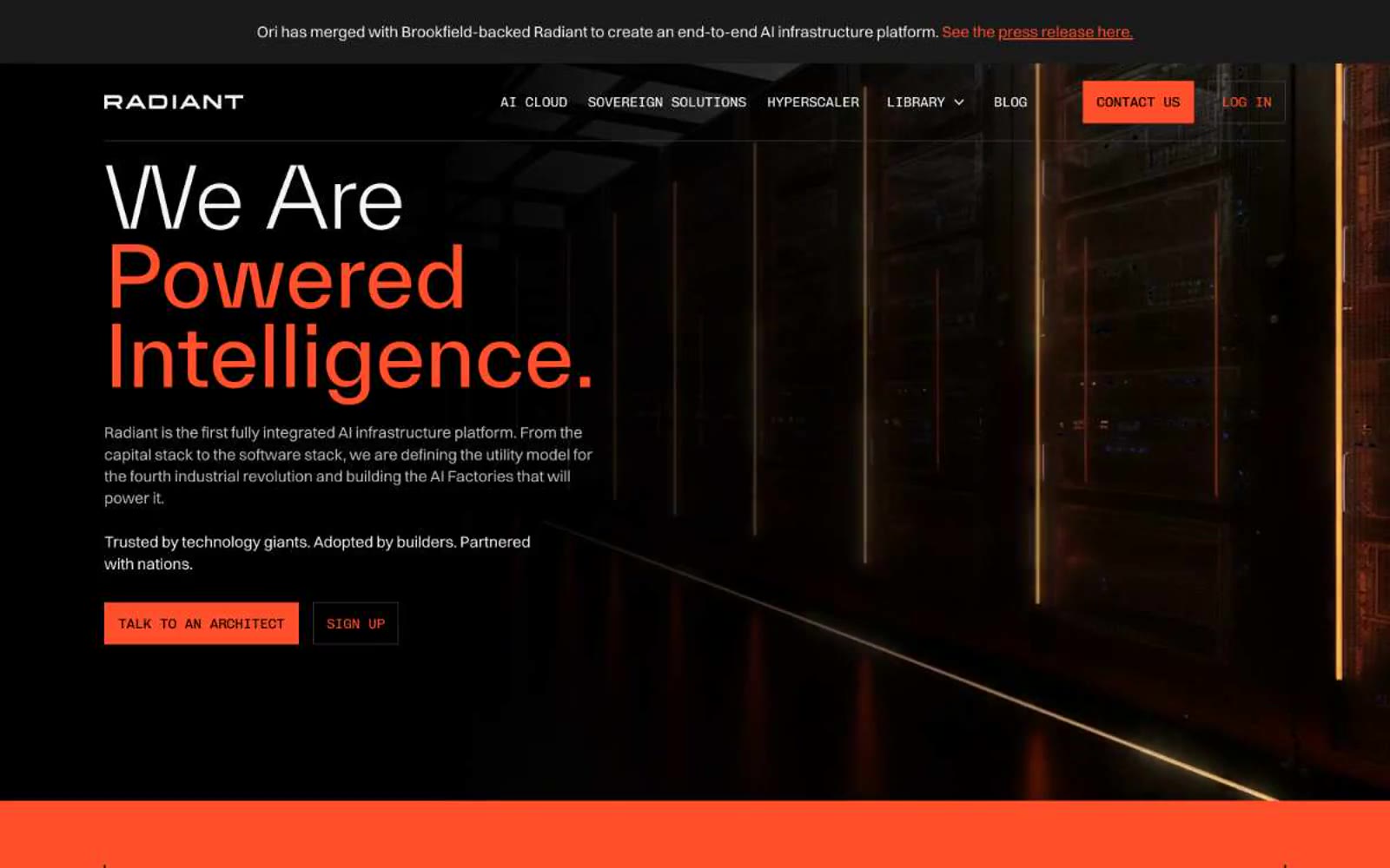
> Server-room at midnight — black void, white light, one ignited switch.

**Theme:** dark

Source measurements are normalized; roles and recommendations are interpreted. Font summary lists are independent, not paired by position. HTML examples are reconstructions, not source components.

Radiant (formerly Ori) operates in a dark infrastructure-at-night language: pure black canvas, bright white typography at whisper-light weight, and a single saturated orange that ignites action and full-bleed statements. The visual grammar borrows from data-center photography — server racks, neon edge-lights, and hard architectural lines — and translates that into UI: zero border-radius on interactive elements, hairline borders, and monospaced labels that feel like terminal readouts. Headlines in TWK Everett at weight 300 create a cool, confident scale that never shouts; orange is rationed for CTAs, one full-bleed band, and accent details, making it feel like a power-on indicator rather than decoration. The system is text-forward and cinematic — large type breathes against dark voids, sections alternate between black and orange with no gradients or shadows to soften transitions.