# Better Stack — Style Reference
> Midnight SRE console

**Theme:** dark

Source measurements are normalized; roles and recommendations are interpreted. Font summary lists are independent, not paired by position. HTML examples are reconstructions, not source components.

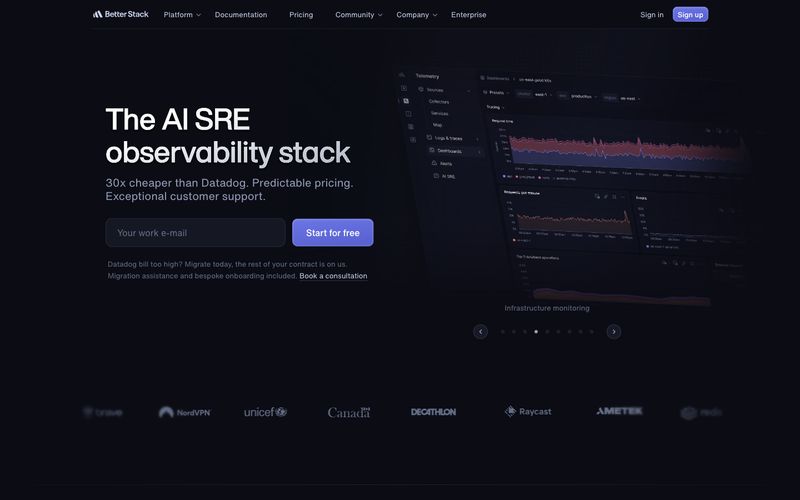
Better Stack operates as a midnight SRE console: a near-black canvas with monochrome surfaces, hairline borders doing the work that elevation does elsewhere, and a single violet-blue accent that surfaces only on actions, links, and gradients. Typography is Helvetica Now with stylistic alternates enabled, giving headlines a crisp, engineered feel — tight tracking, medium weights, and no decorative flourishes. The interface reads like a dark IDE: borders define shapes, inset white highlights suggest depth without drop shadows, and color appears as a scarce resource to mark interactivity. Components are light, flat, and confident — rounded 16px cards, 9999px pill buttons, no heavy panels or skeuomorphic depth.