# 601 Inc. — Style Reference
> warm film marquee in darkness

**Theme:** dark

Source measurements are normalized; roles and recommendations are interpreted. Font summary lists are independent, not paired by position. HTML examples are reconstructions, not source components.

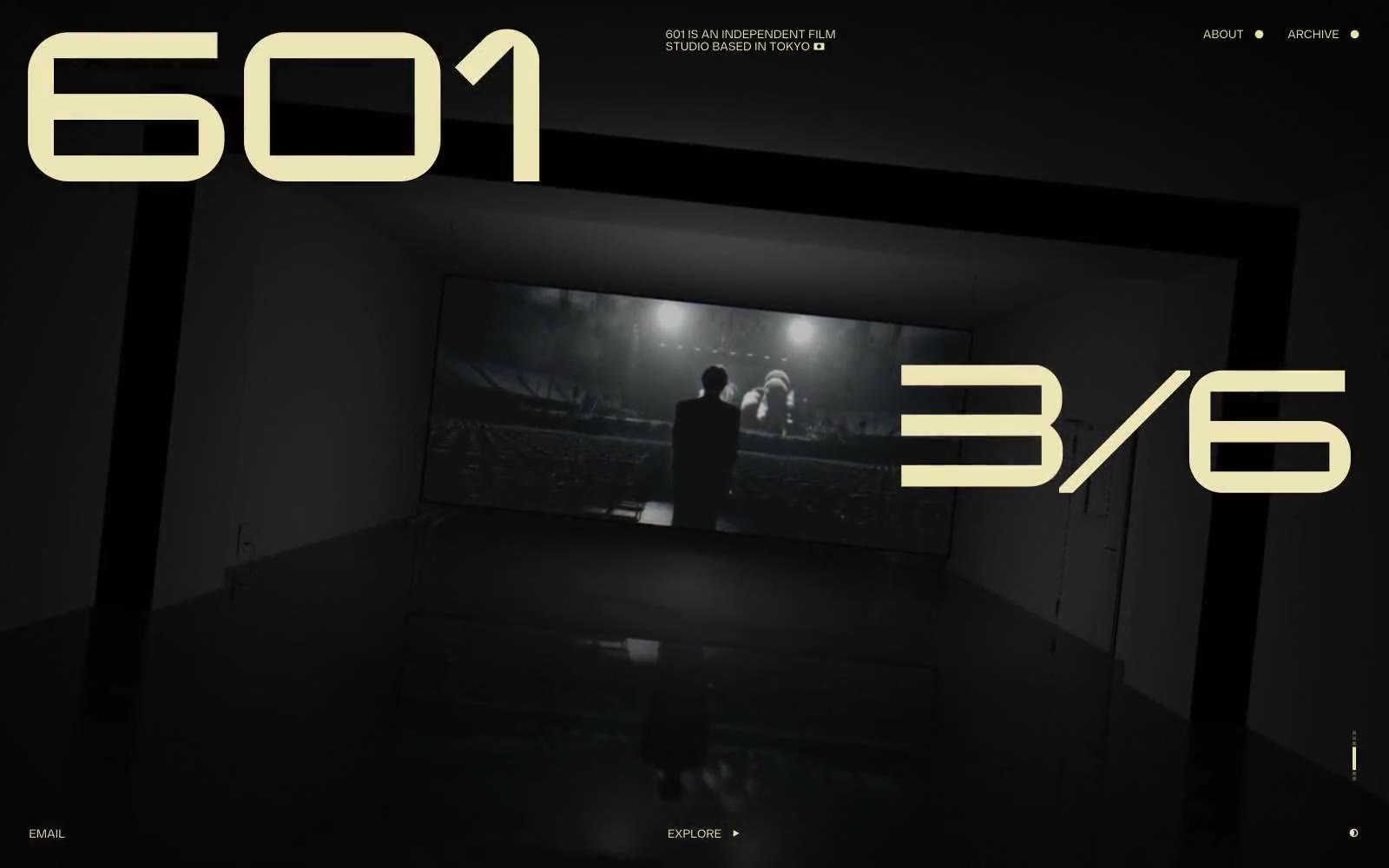
601 is a Tokyo film studio whose visual system reduces the web to the ingredients of cinema itself: a near-black void, one warm cream tone pulled from aged celluloid, and a single custom typeface rendered at architectural scale. The entire palette is functional — cream for everything that addresses the viewer, black for the screen behind it — which forces every compositional decision to be about scale, photography, and silence rather than chrome or ornament. Borders are 1px hairlines, elevation is absent, and the only structure is the photograph itself and the oversized numerals that float beside it like a screening schedule. Every page behaves like a single reel unspooling: a wordmark, a date, a still, and room to breathe.