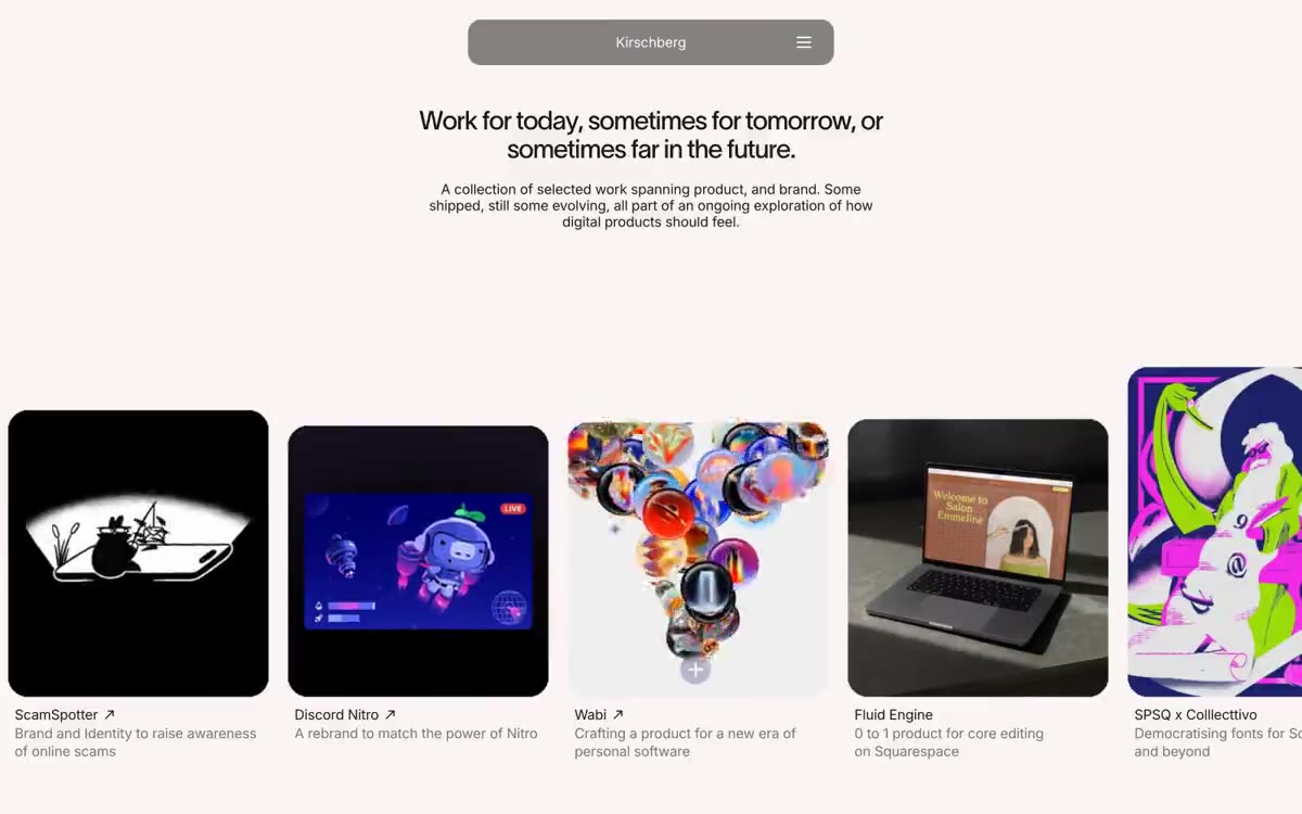

David Kirschberg
午夜画廊墙面:昏暗房间里,聚光照亮的作品是唯一彩色,周围框架有意不可见。
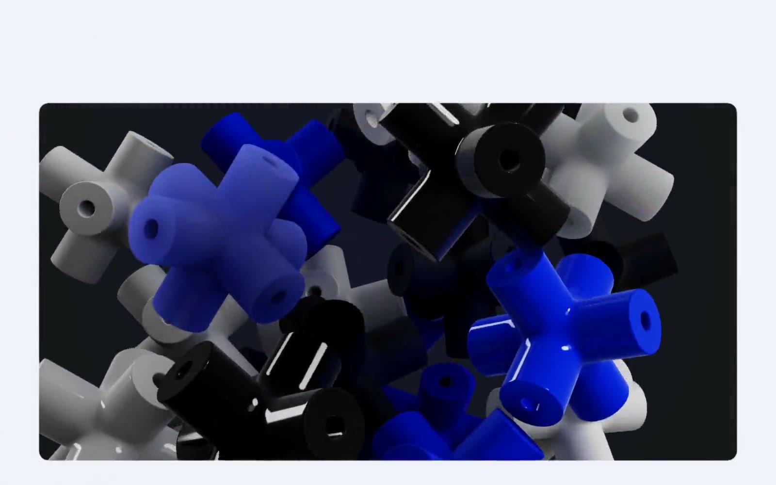
在磨砂薰衣草色平面上呈现 3D 雕塑画廊。每个界面元素都应像可触摸的物体,静置在微凉的浅色画廊地板上,所有色彩与戏剧感均由 3D 内容提供
Lusion 将其官网视为一个数字雕塑画廊,而非普通的机构作品集。整个界面以冷调薰衣草色偏的浅灰白色(#f0f1fa)为底,使纯黑色 Aeonik 文字仿佛镌刻在画布上,而 3D 渲染内容——生动的电光靛蓝十字、抛光金属、玻璃柱体——则注入了每一滴色彩能量。87–100px 半径的胶囊形组件让 UI 体验如同真实物体放置于画廊地板,从不以卡片堆叠呈现。阴影被控制在 4% 的微弱程度;深度与戏剧感完全来自 3D 内容本身,而非 UI 的堆叠。留白充分,导航被简化为最基本元素,少数文本链接采用纯黑色,字间距与正文完全一致,为 -0.02em
查看原始网站午夜画廊墙面:昏暗房间里,聚光照亮的作品是唯一彩色,周围框架有意不可见。
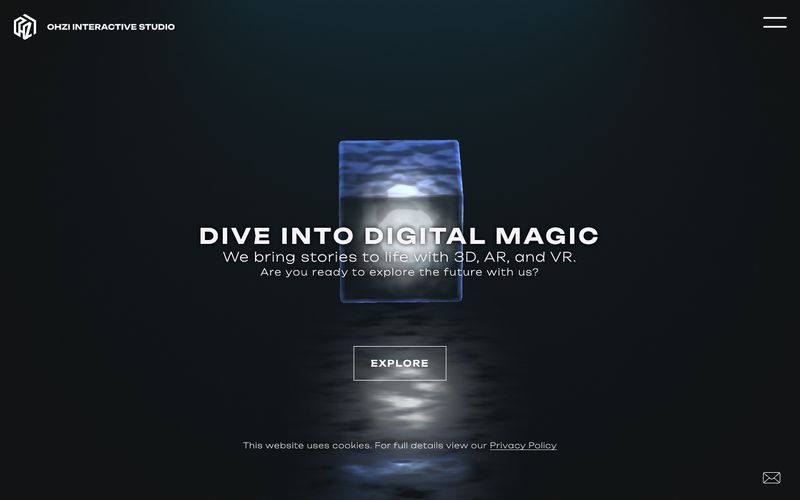

悬浮在深色画廊中的发光立方体。
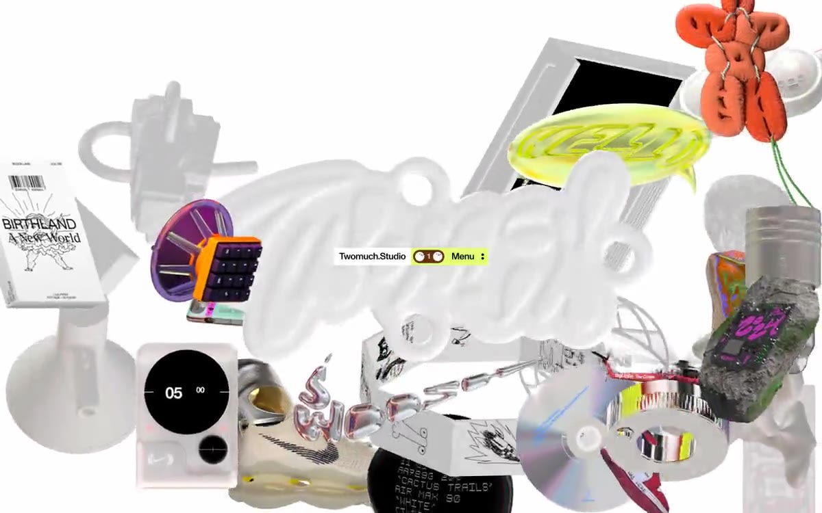

漂浮的珍奇博物馆。
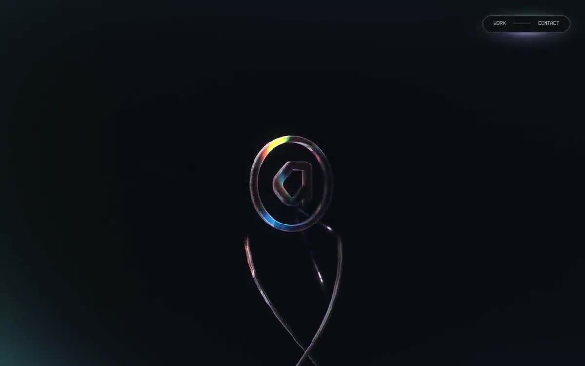

宇宙虚无中仅有一个发光的门户——深空控制台,其中 界面外围元素 如低语,而渲染的世界则高声呐喊
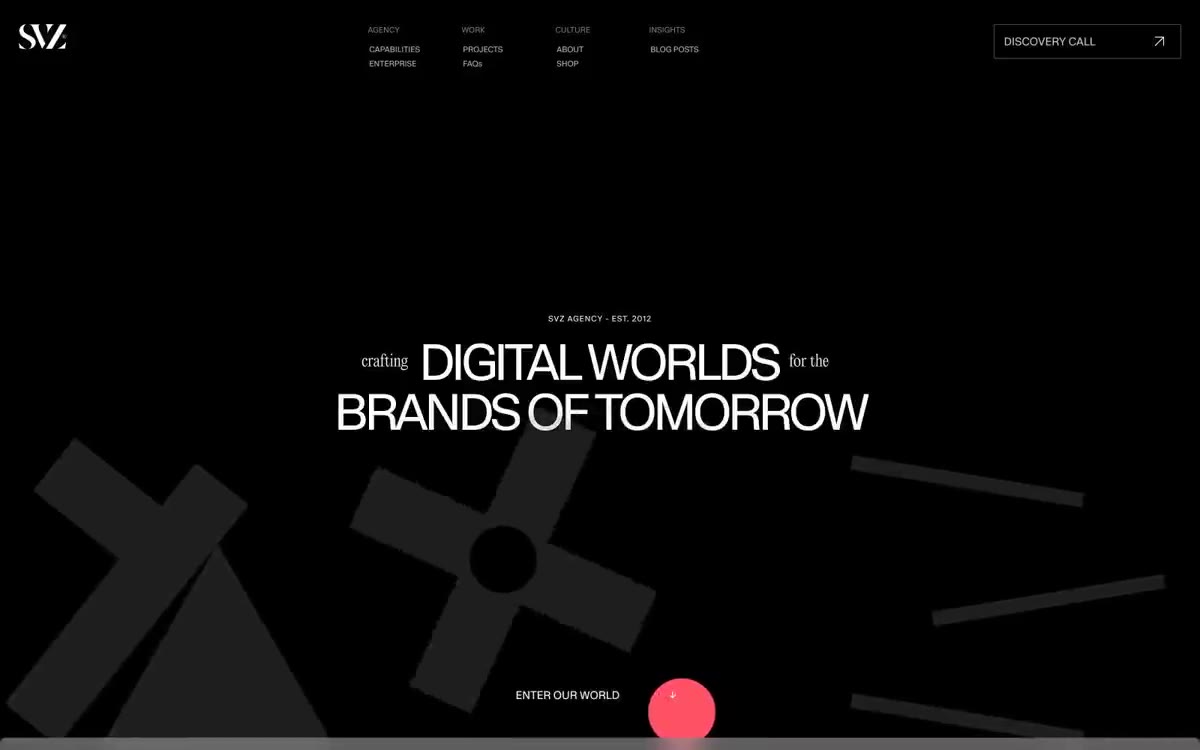

黑色画廊墙面,血红色标点——超大白色显示文字漂浮于类似虚无的深色画布之上,被单个鲜明的红色点缀和戏剧性的装饰性字体打断,整体感觉更像画廊标识而非网页界面。
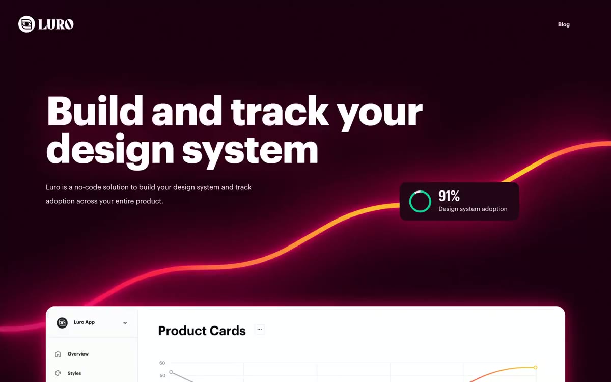

如同深红激光舱:深黑曜石色墙面中,每个表面都被炽热粉色等离子光环围绕。