# Intra — Style Reference
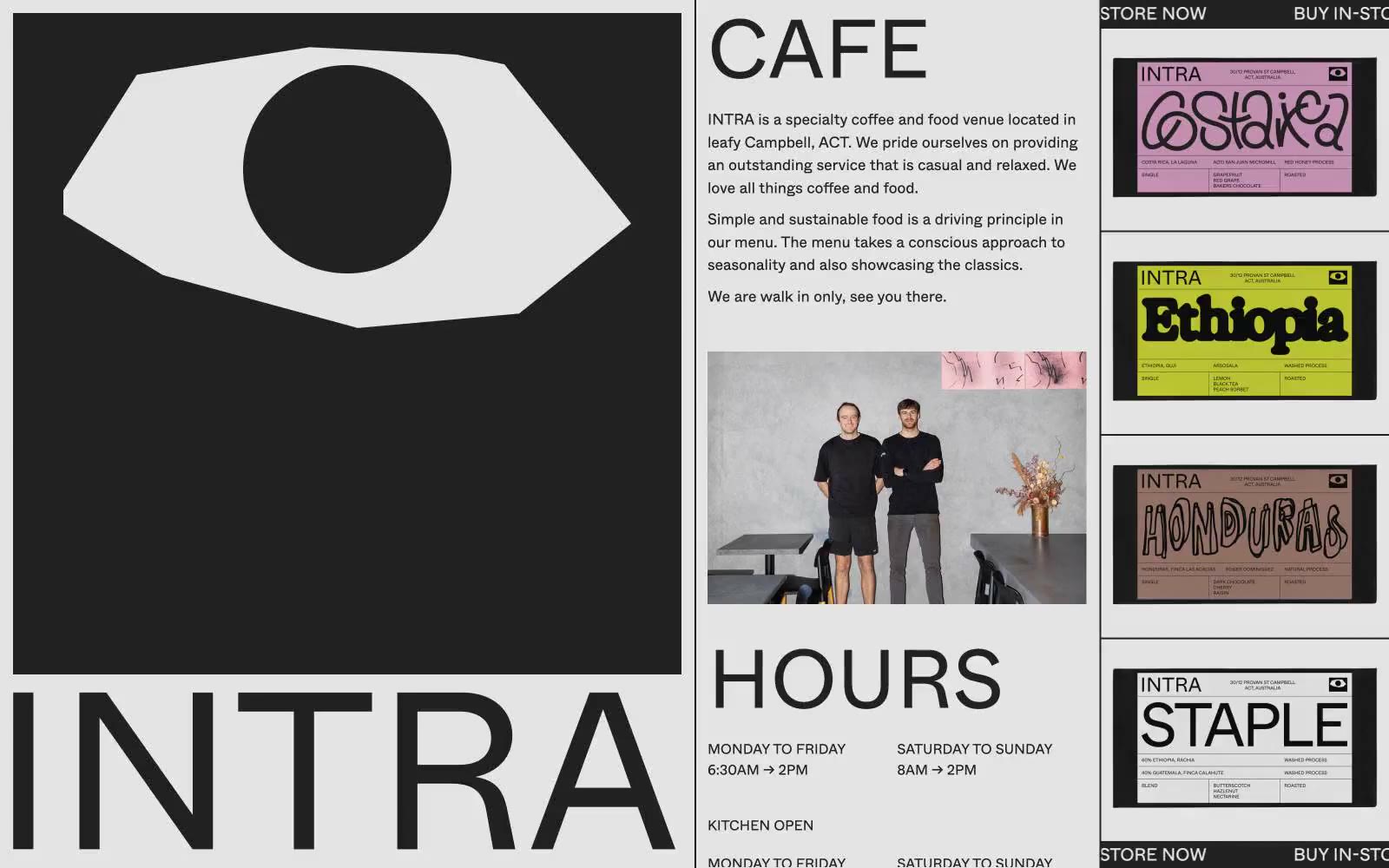
> white-walled gallery placard with one giant black eye

**Theme:** light

Source measurements are normalized; roles and recommendations are interpreted. Font summary lists are independent, not paired by position. HTML examples are reconstructions, not source components.

Intra is a brutally editorial cafe identity: a white canvas dominated by an oversized black eye-mark and gigantic sans-serif wordmarks that read like gallery wall text. Color is almost entirely suppressed — only black, near-black, white, and a single hairline gray — so that the bright packaging of its coffee bags (magenta, lime, terracotta) detonates against the monochrome page like curated art objects. Type is the interface: 95px Whyte at weight 400 does the heavy lifting that buttons and color would do on a conventional site, and every section breathes through generous 100px vertical padding and wide 50px gutters. The aesthetic borrows from Swiss editorial print, brutalist signage, and museum labeling — content is presented as a series of facts, images, and objects rather than wrapped in a product UI.